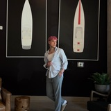
New Hights - Blueberry, Pineapple, Lychee
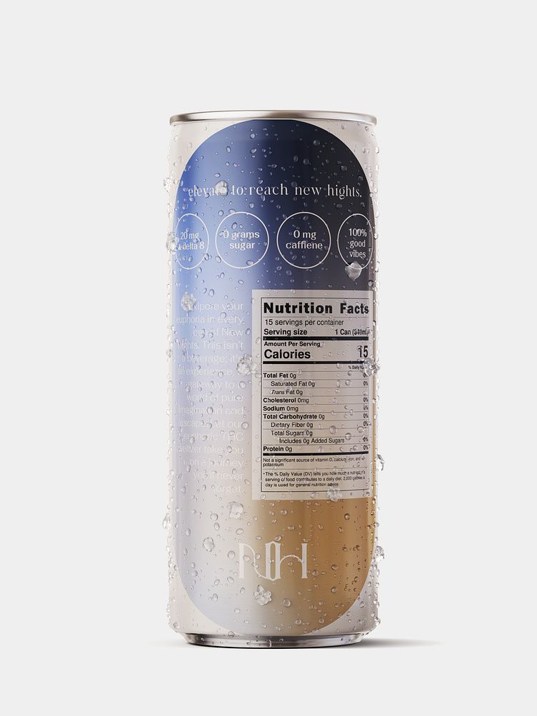
The inspiration behind the design on the back of the can was to create a timeless artistic vision with flares of influence from past trends. The color gradient was chosen to reflect the tie-dye trend popularized by the Y2K fashion trend, creating a sense of nostalgia and familiarity for the brand's target audience of young adults.
The design incorporates multiple gradients that blend seamlessly together, creating a fluid and dynamic effect that draws the eye. The shape chosen for the design creates a focal point without overpowering the fluidity of the gradient, making it the perfect canvas for showcasing the brand's identity.
Each gradient reflects the ingredients of the flavors, creating a sense of identity and purpose behind each color scheme. This attention to detail adds depth and personality to the design, making it more than just a pretty visual but a reflection of the brand's values and commitment to quality.
The choice of a color gradient inspired by past trends, the fluidity of the design, and the attention to detail with the ingredients all come together to create a design that is both timeless and current.