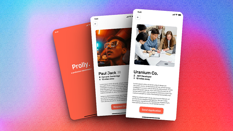
Prolly - A Profession Matchmaker UI
A tinder-linkedin intersection idea.Businesses can list out their needs for professionals in the required portfolio and professionals can look out for freelance works, hiring companies or startup mates. Works as simple as tinder, a right swipe is an application from the professional and a right swipe from the business manager/user is a yes to the proposal. Exactly how a marriage matchmaker works, both/all users can go through their portfolios, work references and previous projects, think and apply or hire!
First Draft
This was my first ever UI design I made 12/12/2021 in Figma.
This is the point of view of a job searcher or an employee, the employee can right swipe to view more of the company and send application/cv and get talking with the recruiter.
This is the point of view of a recruiter who can as well right swipe to view more of the applicant/employee and request cv/portfolio.
This was the on-boarding flow.


