Ryte rebranding
Ryte is a SaaS (Software-as-a-Service) company based in Munich, Germany. The company needed a new fresh identity that would visually support the strategical change from SEO software into a holistic Website User Experience platform. We got a new rainbow-colored logo, that was created by external design agency. My task was to create a new branding, color palette and typography, that would be used on a marketing website first, and in the software later.

Visual identity research
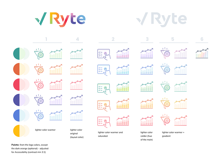
Most of Ryte's competitors were using blue or light green color schemes, which were then excluded from the choices.

There was a challenge - new colors had to have enough contrast for accessibility reasons, and also be not too dark to match the new bright logo. After a careful selection purple and emerald green tones from the new logo were chosen as the primary and secondary colors, with supporting warm red, orange and yellow. An interesting alternative that i wanted to keep was a multi-color gradient.

Typography

Web design
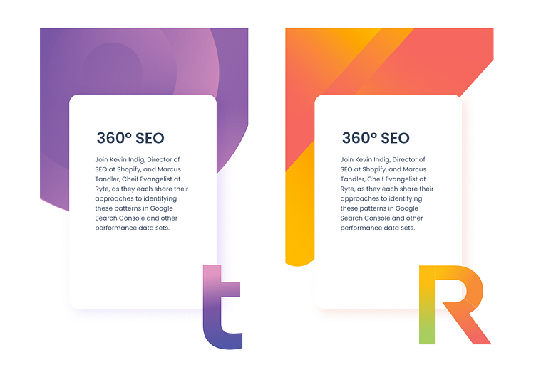
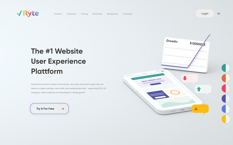
Initial draft of the homepage, provided by external designer together with the logo, and its adaptation to the new color palette:
Next we needed to adapt the graphic representation of our Tools. In 2021 Ryte had several tools, each targeted at a specific customer group, integrated in one platform.


Website color theme

Spoiler: even though these initial designs were taken positively by the stakeholders, company made a strategic decision to move away from purple and choose green as our new brand color. Bright green in an interface is a challenge - see if you like the result!