Seqera skill test
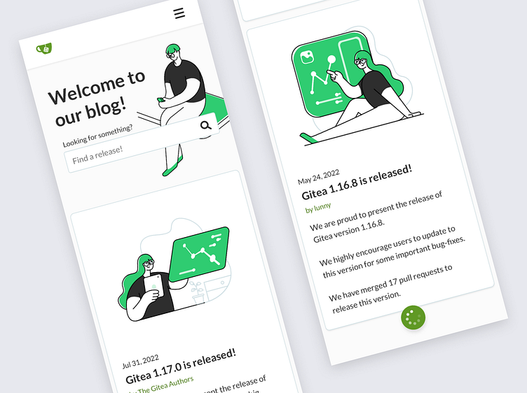
This design was a test for Seqera. The test was about re-designing a blog page.
Seqera test
Previous considerations
The web page is a blog, so I assume it should have a mobile first approach.
The menu is not part of the blog (but I will redesign it anyway).
I will keep the brand color (#609925) and the variation included (#2FCC71 more vibrant) and I will create some more.
I will keep the typography (Lato) I will keep the logo The blog should be accessible (I use “Cluse“ plugin fo Sketch).
Top menu mixes internal and external links. There should be a differenciation.
Ideas
The blog and the Linkedin post should keep the same look and feel.
Posts need images (from a repository).
Almost every post is about new releases, so it is difficult to find different images for each.
Brand color is not accesibble for texts, so I’ve created a new one White and fresh with vibrant color as contrast.
Fun and geeky, with a not-so-serious langanuge and nice characters Infinite scroll


