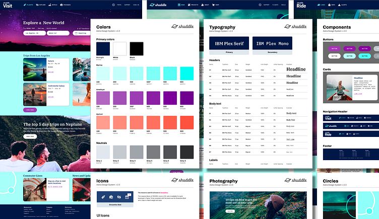
IPTS Rebrand Case Study
As apart of the Dribbble Scaling Design Systems course this is the second part of the assignment which demonstrates the benefits of a design system and how they prove their value most at the times of change.
Project Brief:
Leadership at the IPTS — the Interplanetary Travel Syndicate — just hired a prestigious branding firm to do a rebrand of the entire organization, and there are a few things that will affect the three products — IPTS Travel, IPTS.org, IPTS Rail.
The branding firm discovered through focus groups that the IPTS name and logo felt very ominous, like it was cold, faceless corporation that was always watching. (“The eyeball-shaped logo doesn’t help,” said one candid participant.) In addition, the IPTS wants to appeal to a younger demographic.
After weeks of research and exploration, they’ve settled on the new name “Shuddle,” which feels more like a cool, new startup.
The three main products have also been renamed to feel more like a family of products instead of independent offerings:
IPTS.org > is now Shuddle.world
IPTS Travel > is now Shuddle Visit
IPTS Rail > is now Shuddle Ride
The documentation for the rebrand included the following specifications:
Color Palette: The color palette is fresh and vibrant to feel more welcoming and inviting.
Typography: The new typographic palette relies heavily on the IBM Plex superfamily to both give a wide range as well as make everything feel familiar. This Google font family includes IBM Plex Serif and IBM Plex Mono.
Photography: To appeal to a younger demographic lifestyle photography is used wherever possible throughout the imagery as well as a human element appearing within the destination imagery so the audience can have a sense of feeling they are there.
Research/Analysis:
To evaluate the level of effort I documented the order that I would make the changes:
Color Palette and Typography
Photography Research
Button component
Card component
Footer component
User feedback determined the Navigation Sidebar was not as user friendly as expected. So it was decided to combine the two navigations into one - removing the Navigation Sidebar. And as an additional benefit for users a search option was also included for the Shuddle Visit and Shuddle Ride websites. The Navigation Header would be the last component updated.
Navigation Header component
Implementation 1
Before making any changes to the actual components, I first used the Shuttle Visit homepage to determine the following:
COLOR STUDY: When a color palette is provided sometimes it is created within a vacuum without evaluating how it can effectively be implemented within an existing interface. So a color study was required to determine how to best use the color specifications to achieve the best result in tone and readability across a sampling of the homepage elements.
TYPOGRAPHY: Since the original brand included two font families for headlines and body copy implementing the new fonts was one of the easiest steps. However, I did notice that character count will need to be reduced for the card component since the new body copy font is extremely spaced out - since not all fonts are created equal in shape and size.
PHOTOGRAPHY: The new brand focuses heavily on lifestyle photography, a challenge for the subject matter of space travel. To accomplish this goal, extensive photography research was done to find images that represent travelers in the surroundings of the destinations so the audience can have a sense of feeling that they are there.
CARDS: Once the color and typography was set the component was updated.
BUTTONS: Color states, typography and pill-shaped changes were made to this component.
FOOTER: Color and typography changes were also made to this component.
NAVIGATION HEADER: The two navigations were combined into one Navigation Header which now include the revised logos, main and secondary navigation as well as a search feature for all three websites.
Implementation 2
Now for the fun part! The revised design system was applied across all three websites. The below images show the before and after results.
Challenges and Solutions
The biggest challenge was working with the brand that was provided. In a real-world situation there would be more interaction and conversation with the branding firm sharing the existing IPTS family websites to be sure the provided brand could easily work and still provide the same overall result.
The most time spent was color studies, photography research and adjusting the logos so the "Shuddle" word for Ride and Visit logos were readable in smaller formats. Updating the design system was a breeze!
Results and Impact
The biggest impact was how quickly I was able to implement the new brand across all three websites once the design system was updated.
Conclusion/Summary
Benefits of creating a design system:
Faster builds, through reusable components and shared rationale
Better products, through more cohesive user experiences and a consistent design language
Improved maintenance and scalability, through the reduction of design and technical debt
Stronger focus for product teams, through tackling common problems so teams can concentrate on solving user needs
Overall learnings from part two of this course include:
A new brand that is fully vetted is helpful for overall speed of updating a design system.
A design system is a product in itself which is ever evolving.
Thank you Adelina and all my teammates for the support and feedback throughout the project.
References
Software and Plugins:
Dribbble, Figma, Chat GPT, Zeroheight, Streamline icons, EightShapes Specs, Unsplash, Lore, Contrast Checker
Reference Books:
Atomic Design, by Brad Frost
Expressive Design Systems, by Yesenia Perez-Cruz


