Raeven Brand Identity Design 🐦⬛️
Raeven's Story
In our design studio, we wanted to create a brand that truly embodied our values and mission. That's why I offered Raeven, a unique spelling of the word "raven," which symbolizes power, creativity, and grace. We believe that this name truly captures the essence of our studio and sets us apart in a crowded industry. As brand identity designer, I gave Raeven a character all its own, with a visual identity that reflects our studio's values and mission. We are excited to see how our brand will continue to evolve and make a lasting impression on our clients and the design world.
Logo Concept
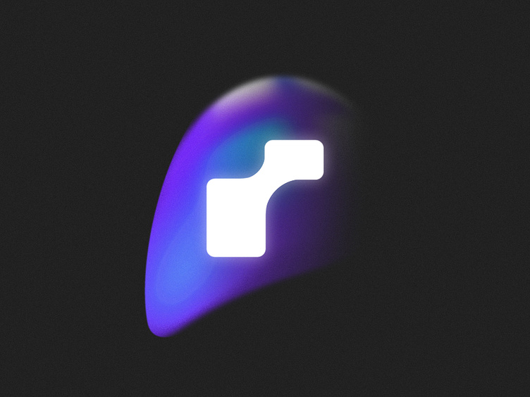
my goal with the logo was to convey the concept of unity and strength through the use of Raven's wings to form the "R" lettermark. Rather than creating a literal representation of a raven, I wanted to create a more unique and subtle design that would still be recognizable and memorable. By incorporating the collective imagery and the powerful symbolism of the raven, the logo represents not only our brand but also the people who make up our team. Overall, the logo is a perfect representation of our brand's values, mission, and identity.
Logo Grid
I created the logo with a focus on versatility and practicality. The logo is designed to fit perfectly within a square, making it adaptable to various platforms and products. This approach ensures that the logo remains consistent and recognizable across all applications, whether it's on a business card, a website, or a social media platform.
Logo Lockups
A logo lockup is a carefully arranged and positioned combination of the logo mark and the company name or tagline. It's a crucial element of brand identity that ensures consistency and recognition across different media.
Color Palette & Logo Color Variations
I took inspiration from the raven's wings to create a unique color palette for our design studio's brand. We chose a combination of blue and purple tints that reflect the power, creativity, and transformation associated with the raven. These colors convey trust, creativity, and sophistication, embodying our studio's values and mission.
Typography Pairing
Typography pairing is an essential aspect of graphic design, and it refers to the art of combining different fonts in a design composition.
Pattern
A brand pattern adds an extra layer of depth and meaning to a visual identity, reinforcing the brand message and creating a memorable and unique look.
Web Design
I collaborated with my teammate, Hassan Rouhani, who is a product designer at Raeven, to create a cohesive web design that reflects our brand values and mission. We used our brand color palette of blue and purple tints, inspired by the hues found in the raven's wings, to make a visually appealing and memorable website.
Do you have any projects?
🟢 I'm available | ✉ My Email: skeizie@proton.com
-----------------------------------------------------------
We are available for a design project:
📩 Work With Us: raventeamstudio@gmail.com


