CLEAN FORCE | Logo Case Study
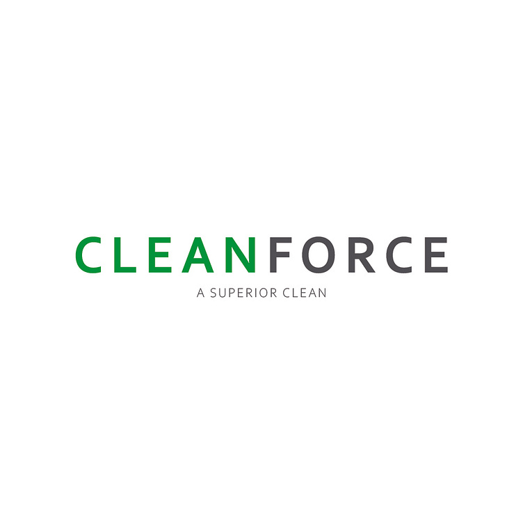
CLEAN FORCE | A Superior Clean
CLEAN FORCE is a corporate cleaning company with branches all over the United States and Canada. They specialize in the industrial cleaning of offices, construction sites, biohazards, hospitals, schools, and more.
The logo design was intended to be straightforward and forceful. We opted for the sans-serif font Corbel which features sharp edges and corners. Rather than put a space between the words, we pushed them together and chose two contrasting colors to differentiate them: green for that classic clean feeling, and a medium gray to convey the direct nature of the brand, as well as catering to the various industries of their demographics.
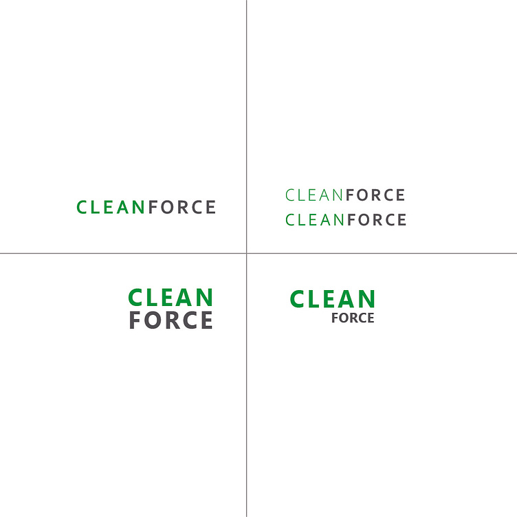
Some other logotypes we played with before selecting the final logo are below.
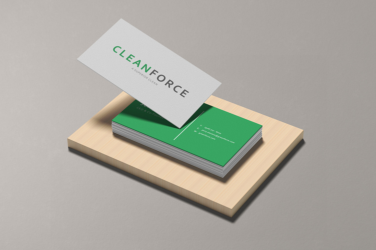
THE BUSINESS CARDS
The business card for CLEAN FORCE is their single biggest marketing strategy. They get their new clients through word of mouth and partnerships with large corporations. CLEAN FORCE leaves business cards at every job to better spread their superior cleaning strategies with North America.
The logotype and tagline are on the front on a stark white backdrop, while the back of the card harnesses the branded green and white text.
