New Double Dip Identity
Finally got around to finishing my new branding!
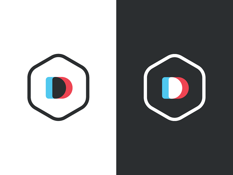
It was important to me that the mark be simple, versatile, and timeless. I tried a crazy amount of options doing lettering, but ultimately I wanted to set myself apart from everyone else (plus it had to look good on a hat, because that's obviously the standard to go by :P). Even stumbled on a happy accident with the left version representing print color mixing, and the right representing screen. So I got that goin for me, which is nice.
Overall, I'm super excited about it. Let me know what you think, good or bad.