Cart & Checkout Enhancements

Year.
2022
Role.
Product Designer
Tasks.
Research & Analysis
Design
Usability prototyping
Between the shopping cart and checkout together with the UX Guild, we gathered and analysed 35 actionable insights from Content Square, customer interviews, competitor analysis and Google Analytics.
This gave us an opportunity to really have high impact on improving our customer experience. We opted not to run individual experiments because this would take too long to build and implement individually. Each experiment requires at least 2 weeks runtime, with further analysis needed to validate results.
Therefore, it was a collective decision to completely redesign the cart and checkout flow based on the insights obtained. This was a big undertaking, so the use of these insights made us confident in the changes we were going to push to users. The new designs were put through a few rounds of usability testing to ensure the problems we set out to solve were well received by our users.
The Change.
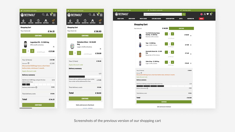
Our shopping cart had some complex nuances to cater for our saw tooth shipping logic, as well as the go-live of our marketplace in the Netherlands.
However, in summary some of the key changes improved the following:
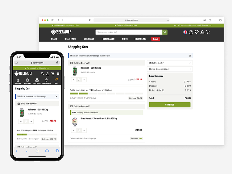
Split sellers into different boxes in the cart to differentiate when items will be fulfilled by different parties with different lead times
Improved information hierarchy to keep messaging contextual (Minimum order quantity and free delivery messaging)
Clean up a very complicated order summary
Introduced dedicated space for optional informational messages
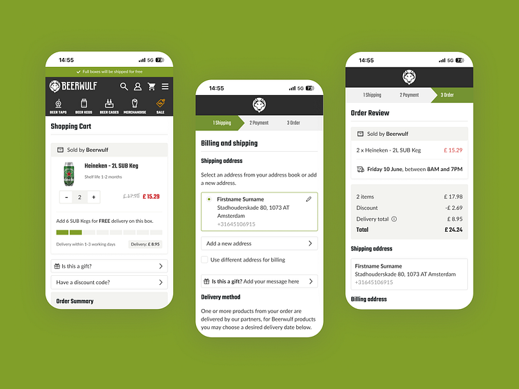
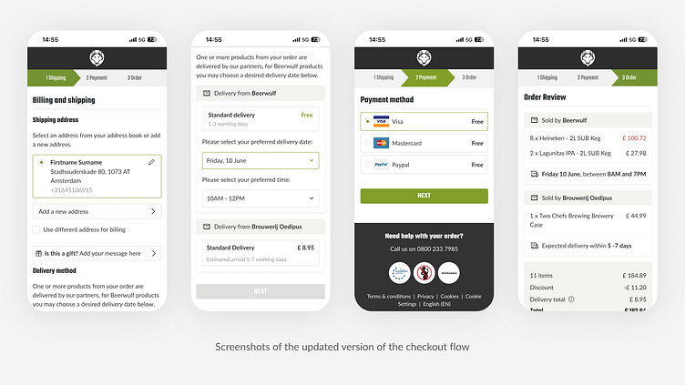
Checkout flow.
This project also included a redesign of our checkout flow to align with the new cart UI and prepare for marketplace.
I designed different flows for logged in users and guest users as the experience differs. The before and after screens below are for logged in users.
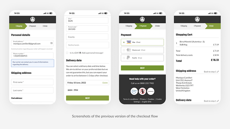
The old checkout stored all the information in form fields. Not only is this visually unappealing, it was a very long and daunting task for users to complete and process what was required of them.
In the final step of the checkout process, just before placing an order there were too many options to navigate backwards and change information in previous steps. The main focus at this point of the flow is to review the order and information and place the order.
Interaction Prototype.
I built the new cart concept to conduct usability testing before handing over the final designs for development. The engineers also made use of the prototype to ensure the new designs were implemented according to specifications.
Future iterations.
To make it easier to proceed through checkout on mobile devices, we will introduce a sticky order summary component.