Revolve - Logo Concepts
Revolve is a full-service Bitcoin mining hosting provider operating a 20 MW facility in the US, with a 10,000 sqft in-house repair center and a world-class training facility.
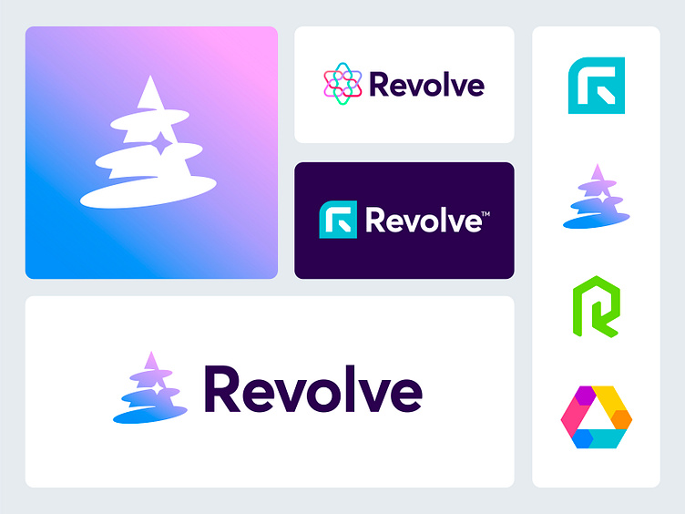
As Revolve is set to turn this industry in a more environmentally conscious direction, elements of innovation, green energy came to mind. I captured several potential reference points and turned those into a unique looking brand symbol. Especially I am liking this drill-wizard-hat idea that could fit the innovative and energy friendly direction of Revolve pretty good imo. Though, still not sure a wizard would be suited to these goals I had I mind. All part of a creative journey that I went through that helped me discovering alternative and unusual directions here. Why always go for the obvious, right? ^^
I'd be happy to hear your thoughts on these concept directions and possible points of feedback. Which stand out most to you and why?
Have a lovely new week everyone!
Jeroen
___________________________________________________________________________________
___________________________________________________________________________________
Let's work together and elevate your brand!
Feel free to reach out via Dribbble DM or E-mail:
👉 info@jeroenvaneerden.nl
💼 Connect with me on LinkedIn / Read my Client Recommendations
🎬 Check my YouTube for Logo Tutorials / Learn Logo Design
🔗 Follow me on Instagram / See BTS and New Content
🛒 Buy my pre-made or unused logos from the portfolio
💬 Tweet with me

