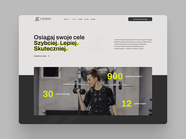
4 Senses website redesign
Hello!
Here is my idea for 4 Senses website redesign I've recently worked on.
This is a workout studio specializing in EMS technology workouts.
The main task was to attract new customers to explore the offer and find them interested in buying a membership.
What was done?
• eye-pleasing color palette with one contrast yellowish color
• readable typography
• organized content
• good quality images
What do you think about the result? 👀
More by GABA STUDIO View profile
Like


