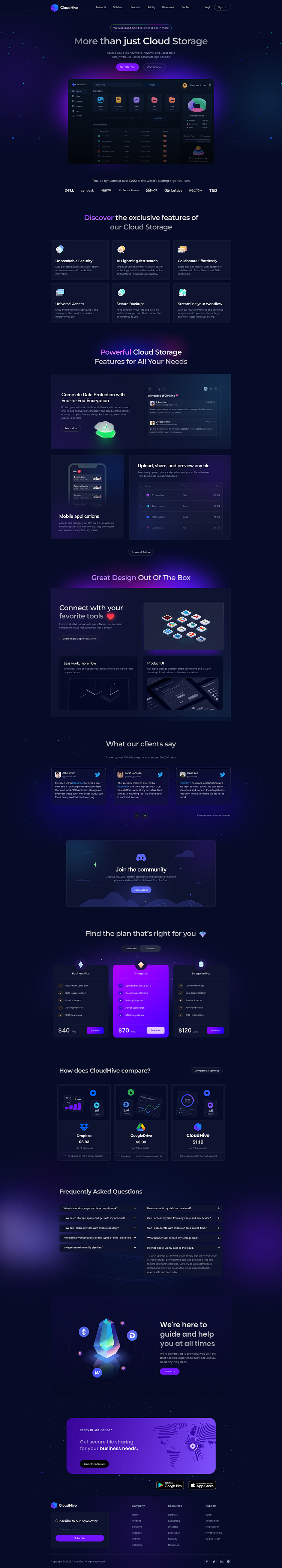
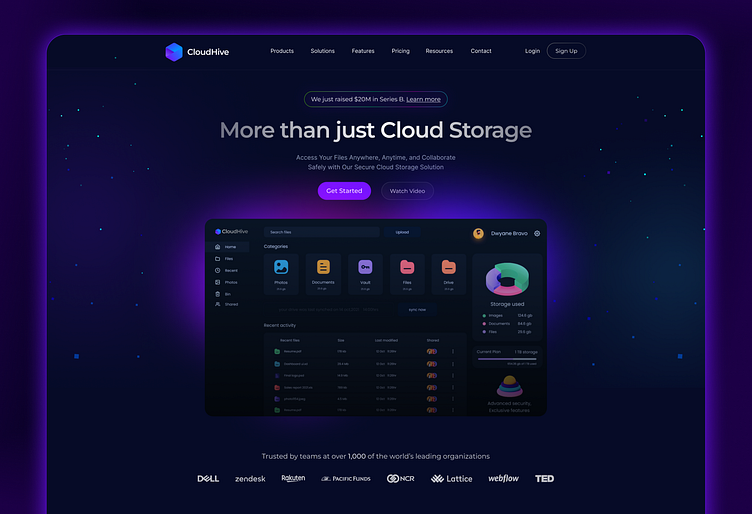
Cloud Storage SaaS Website Landing Page
Hello everyone 🤩
I am excited to share my latest design project with you - a landing page for a cloud storage and file sharing SaaS website. This project was a great opportunity for me to explore the intersection of design and functionality, as I aimed to create a user-friendly interface that seamlessly integrates secure cloud storage and file sharing capabilities. In this post, I'll be sharing a few key elements of the design, including its purpose, notable features, and design inspiration.
Project Name and Purpose
CloudHive is a secure and easy-to-use cloud storage solution that allows
users to access their files from anywhere and collaborate safely with others.
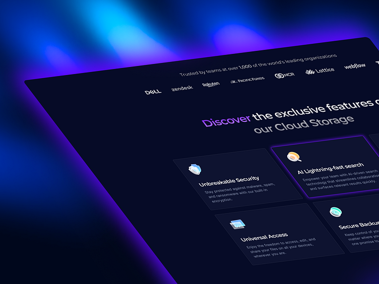
The landing page is designed to showcase the exclusive features of CloudHive's secure Cloud storage solution for businesses of all sizes.
Design Inspiration
For the design inspiration, I drew inspiration from the dark-themed and futuristic aesthetics, which are currently trending in the tech industry. The purple and blue gradients and glowing light rays are used to create an immersive and captivating experience for the users. The glass-themed icons add a touch of elegance and sophistication to the overall design.
Notable Features
The landing page highlights key features of CloudHive, including unbreakable security, AI lightning-fast search, effortless collaboration, universal access, secure backups, and streamlined workflows. Each feature is presented in an intuitive and visually appealing manner, with concise and informative descriptions.
Design Process
To create the CloudHive design, I used Figma and followed a user-centered design approach that involved research, wireframing, and prototyping.

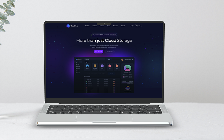
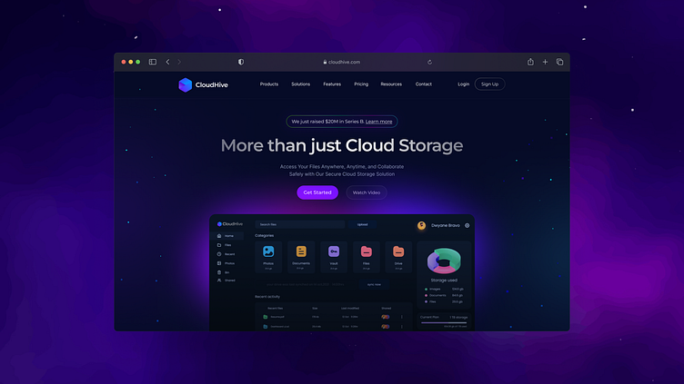
Full Preview 💙