Bright Funk - Logo design for the art agency
Happy to share with you our new project and involve you as a part of our big journey!
Bright Funk is a global art agency creating beautiful animations, illustrations and 3D. They are our reliable partner that has very talented people on the team.
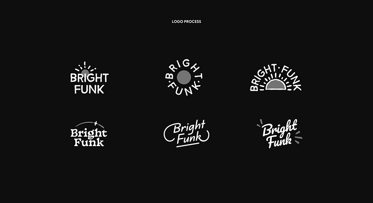
This week we will share 5 pieces of our extensive case study related to Bright Funk and today we will show you a logo design.
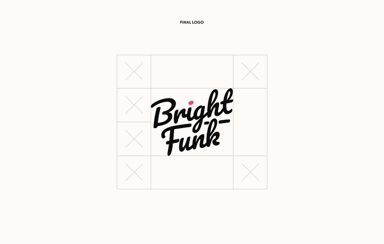
Logo Design
Our logo is inspired by the vibes of surf culture. Soft lines convey informality and relaxation.
The slope reflects the dynamics and desire for the development and
creation of the new.
A dot above "¡" is like a symbol of brightness and uniqueness, standing out from the crowd and being bright.