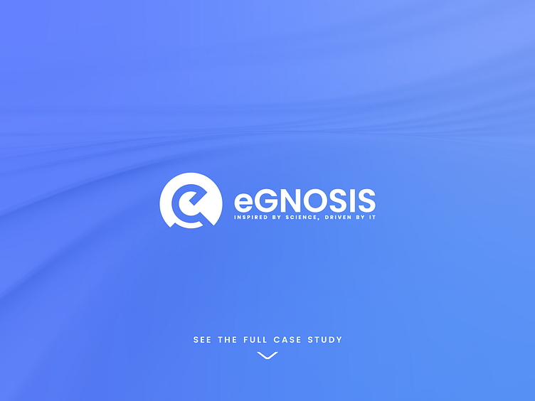
Egnosis logo concept V2
Hey Dribbblers,
During the Egnosis rebranding and logo design process, we came up with a bunch of different concepts.
Here's another one we showed the client!
We'd like to hear your thoughts about it.
This concept was called
Infusion
In this concept, our minds are driven to two very different and exciting territories, inspired by the strong roots connecting us to nature and the particularities of R&D. One element is the knight chess piece with a shape of a horse, suggesting the strong stand and humbleness of the Egnosis brand. The other element we can discover is the shape of a microscope that is a representative tool of the scientific field, suggesting precision and close attention to details.
More by Cognitive Creators View profile
Like


