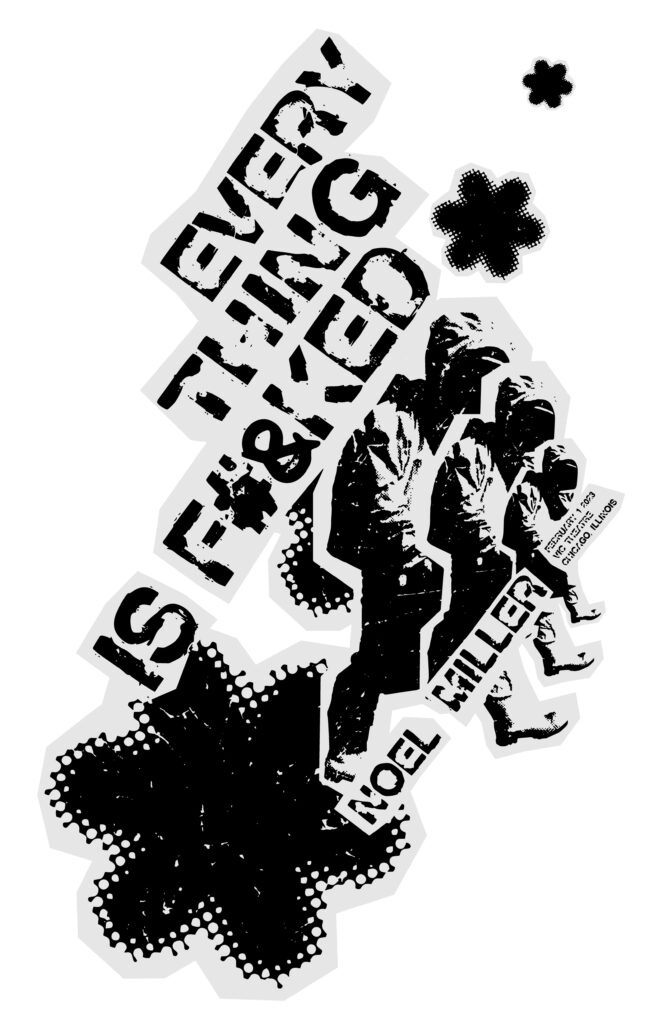
Comedian Noel Miller Poster
Comedian Noel Miller Poster
Promotional silkscreen-pressed poster for comedian Noel Miller’s United States tour featuring his anticipated performance in Chicago, Illinois. Miller’s previous commercial designs emphasized bright colors and twisted hallucinogenic lettering, implying a desire to appeal to a far younger audience. Noel Miller’s dark and mature humor is easily recognizable in this new graphic design and still captures his fearless young-at-heart demeanor. Each component within this collaged-styled poster was assembled by scanning individually printed-out and intentionally damaged graphics.
My Creative Process
I began my brainstorming immediately by moving away from Noel Miller’s original style of commercial designs. This allowed me to start over and I decided to choose to play with different graphic vector images. I chose several objects like a lighter, a man in a hazmat suit, flames, bit-mapped flowers, and a microphone. Choosing these objects required research of the comedian’s personal style. I would identify his style of comedy to be edgy, dark, and playful. I then decided to try fonts that helped push this tone further. By printing out each vector object I was able to discover a cool repetition of these objects that made a neatly organized movement on the page. Deciding to move away from the computer helped me design a rugged look. I chose to crumple up each printed piece and align the information accordingly.


