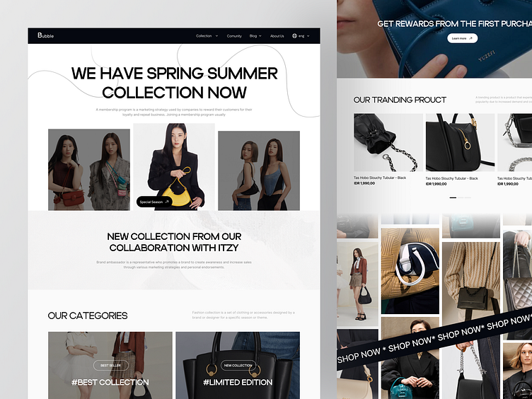
Buble - Fashion Landing Page
Bonjour everyone! 👋
I’d like to share my latest exploration of a landing page for exclusive bag brand for women. It’s called Bubble.
Wanna see what I did? As always, let's scroll!
Cheers! 🤙
Overview
The marketplace was likely created in response to an increasing demand for exclusive bag, or as a means of providing consumers with a convenient one-stop-shop for such items. To effectively showcase the marketplace's unique value proposition, it's important to highlight its key features, such as the exclusive nature of its products, the superior quality of its brands, and the unparalleled convenience of having all these offerings in one place.
To convey the and exclusive of the Bubble products, it's important to utilize elegant and sophisticated design elements. This can include the use of high-quality images, sleek typography, and minimalist layouts. Additionally, crafting messaging that speaks to the exclusivity and quality of your products will help to reinforce their premium status.
Meanwhile, we make it clear to potential customers that they can access our bag products without sacrificing convenience. In terms of color, we conveying elegance, sophistication, and exclusivity. It's important to choose colors carefully as they can greatly impact how your brand is perceived. By utilizing a well-chosen color palette, you can reinforce your brand's premium status and ensure that it resonates with your target audience.
Thanks for checking it out!
Interested in partnering with us?
Say hello at hellodama@odama.io
or visit our website odama.io
Check us more at:
📷 Instagram | 🛒 Gumroad | 🎉 Figma Community | 🛍 Creative Market

