#logodesign #brand #illustration
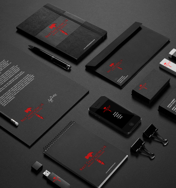
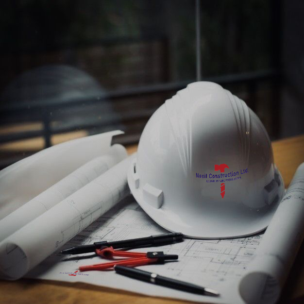
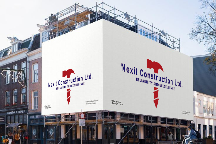
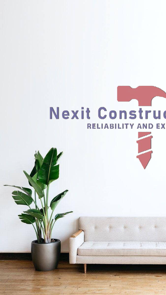
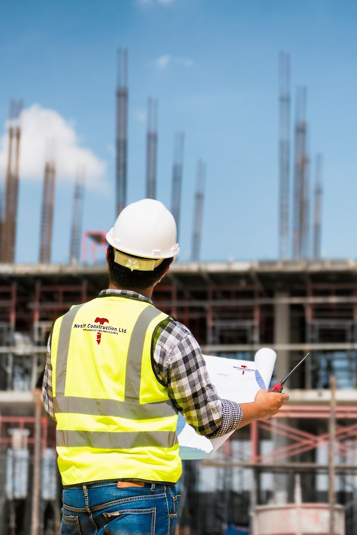
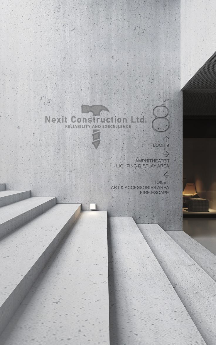
Logo designer for Nexit Construction Ltd. Reflects the key values of the brand: reliability and excellent quality.
The colors of the logo are attractive and correspond to the general theme of the construction company. For this purpose red color was used, which symbolizes strength, energy and dynamism, and blue color, which is associated with reliability, professionalism and stability.
The main image on the logo is a hammer, which is a key tool in construction and is associated with labor, quality and reliability. The hammer is in red to draw attention and make the logo more memorable.
The handle of the hammer as a drill should be displayed against the background of the hammer to create a more complex and interesting image.
In the end, the logo design is created balanced and effective, sets Nexit Construction Ltd. apart from its competitors and displays its core values of reliability and excellent quality.
If you are interested in ordering your own unique logo, contact the author at the link below. I will be happy to complete the task, considering all your wishes and requirements, to create a logo that will reflect your vision and attract attention.
https://www.upwork.com/freelancers/~0157f72831b99d820e
https://instagram.com/niko_2114_li10?igshid=ZDdkNTZiNTM=
Become part of the world with interesting
and memorable logos and brands