Daily UI Challenge #045 || Info Card
Design Challenge Experience
Designing this challenge took me to places, but just in my imagination.
I was in my focus session while working on this challenge, and Microsoft's to-do list and clock really helped me achieve a straight workflow. Except for when my parents needed my assistance.
I was aiming to work faster, but more neater and thoroughly with my decisions in creating the design. It really helps to save time when you don't get stuck making decisions especially when it needs to be just functional and simple.
It was a stretch and a good one.
The Design
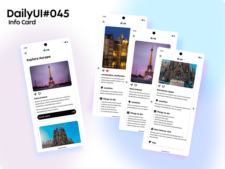
I was aiming for a simple and informative travel info card. Something that you won't have to read very long, but can make you want to go to that place.
The Info Card consists of the image with the name of the photographer.
Below the image are the send and heart icons. You can share it with your friends or on your social media and add it to your Liked places.
The name of the place is in bold font weight and below it is a brief description.
The info card also has its Location, Things to do, the Best time to visit, and Tips to inform the reader about the place.
There are more places other than the featured place, which is Europe.
I might consider designing a full app for this in the future.
I think that I might add more categories in Europe and try to display them at a shorter height so that I can show more places on the screen.
On the left side of the shot, you can swipe left or right to read the information about the place. I think I will add a header at the top to indicate which category the place is in.
I will also find a way to get rid of the arrows completely to lengthen the width of the info card.
The design needs more improvement, but I'm glad to face this challenge
