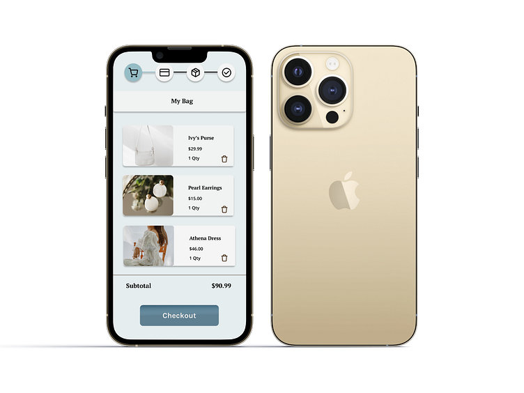
Daily UI Challenge::002 Credit Card Checkout
It took me an excessive amount of time to create this design. I'm uncertain whether I spent more time investigating how to create an ideal card or attempting to develop a prototype.
Nevertheless, I found the process enjoyable.
I have included some gifs below that illustrate the user flow from shopping to entering credit card information. I created two distinct frames for users who have an account and those who are visitors.
Please share your thoughts on any potential improvements. I am excited for the next challenge!
Member checkout process
Non-Member checkout process
More by Amber Pettaway View profile
Like


