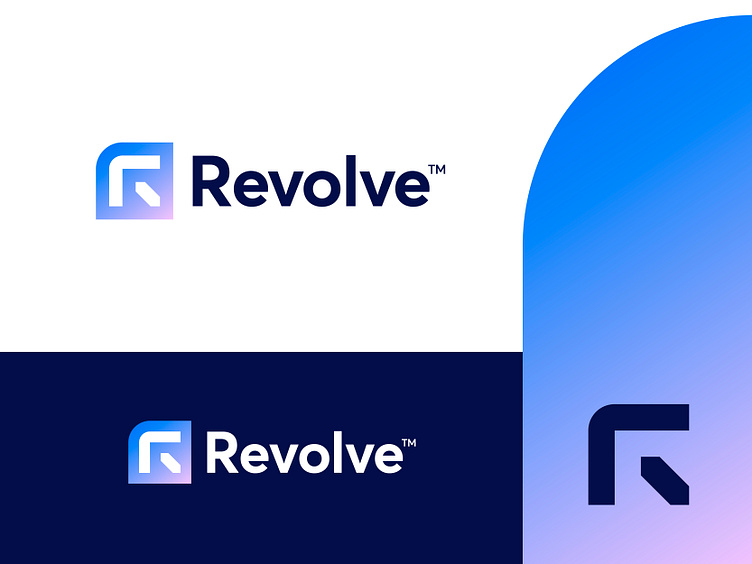
Revolve - Logo Concept v3
Revolve is a full-service Bitcoin mining hosting provider operating a 20 MW facility in the US, with a 10,000 sqft in-house repair center and a world-class training facility.
This new concept is based on the letter R, build out of two simple shapes forming a backwards arrow in a subtle way. With the outer box, I tried to make it more 'unique' looking and somewhat different from the usual logo designs in the Bitcoin Mining industry.
I'd be happy to hear your thoughts on this new direction and possible points of feedback.
Have a lovely weekend everyone!
Jeroen
___________________________________________________________________________________
___________________________________________________________________________________
Let's work together and elevate your brand!
Feel free to reach out via Dribbble DM or E-mail:
👉 info@jeroenvaneerden.nl
💼 Connect with me on LinkedIn / Read my Client Recommendations
🎬 Check my YouTube for Logo Tutorials / Learn Logo Design
🔗 Follow me on Instagram / See BTS and New Content
🛒 Buy my pre-made or unused logos from the portfolio
💬 Tweet with me

