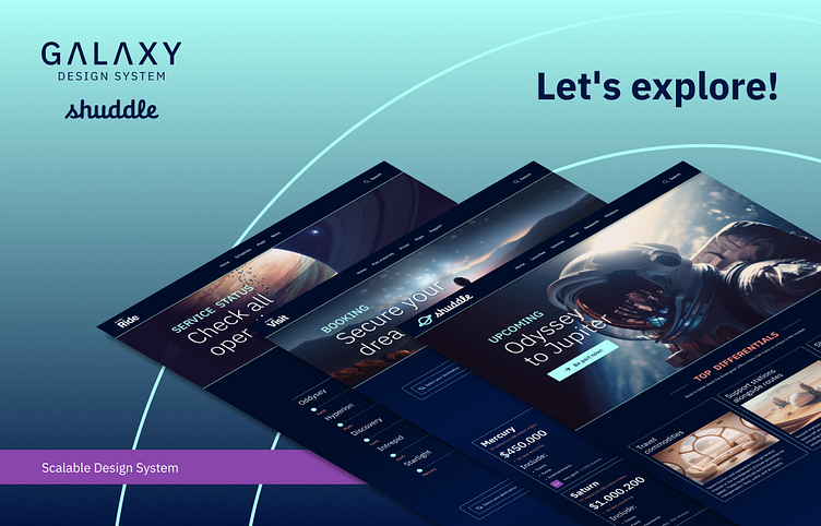
Galaxy Design System for Shuddle - Case Study
Introduction
The challenge is looking to demonstrate how well works a Scalable Design System. As a kick-off, I proposed to create three fictitious products and a design system that would unite them.
Project Brief
The fictional statement
I'm the Head of Digital for the newly launched IPTS: the Interplanetary Travel Syndicate, a bustling transportation network that shuttles people from world to world within our galaxy
My leadership has decided to launch 3 unique offerings:
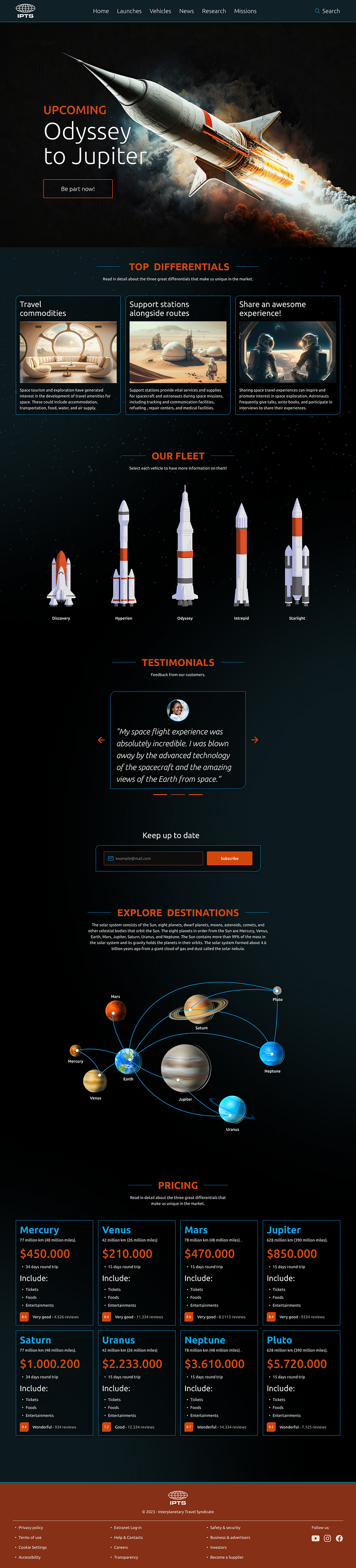
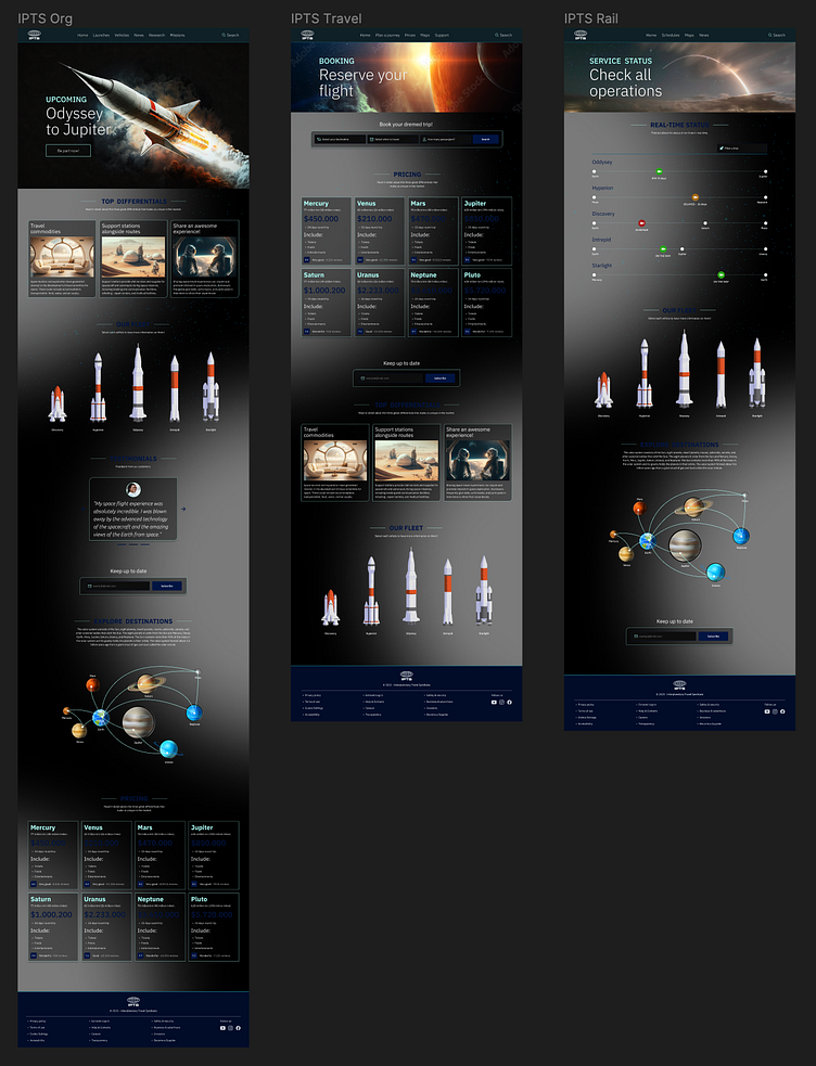
IPTS Org. An informational website where you can find the latest news and happenings with
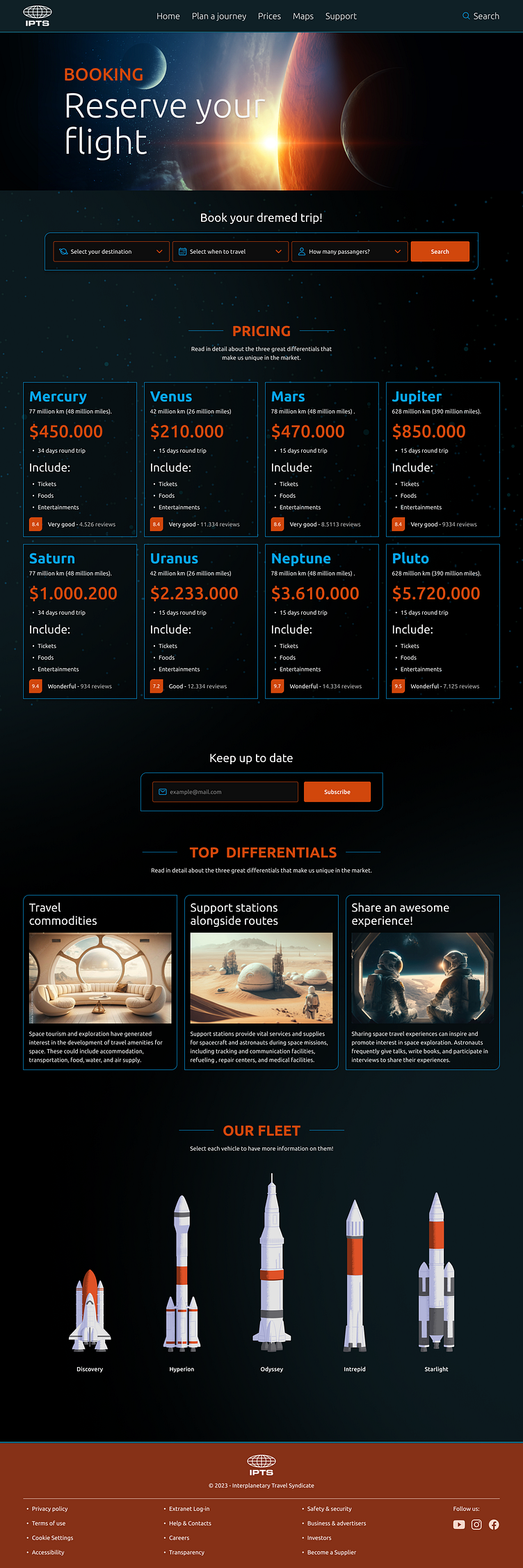
IPTS Travel. A website where you can browse and book travel to and from multiple destinations within our galaxy.
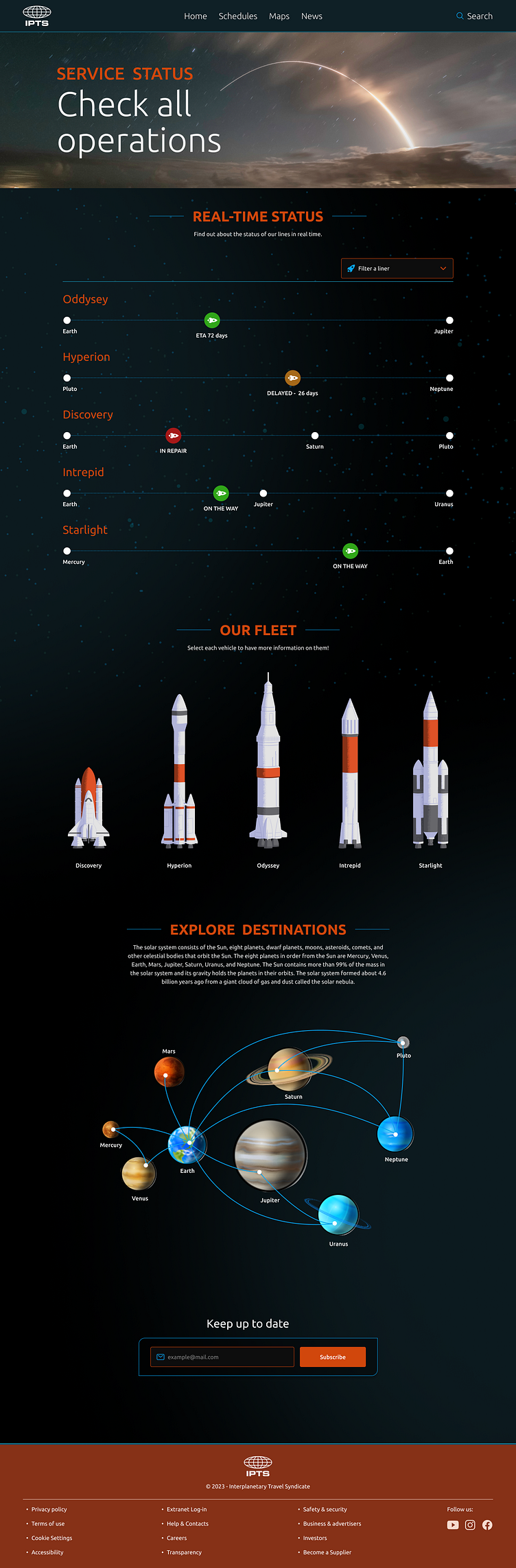
IPTS Rail. A real-time updated web app where you can view lines, routes, and times for all the different commuter lines.
The only asset that they've provided was the IPTS logotype, with no branding guidelines or requirements.

My Role
Being the only designer on the project I've covered all the stages throughout it.
I had to create all three website products, the design system that centralizes them as well as the documentation to support it.
The Process
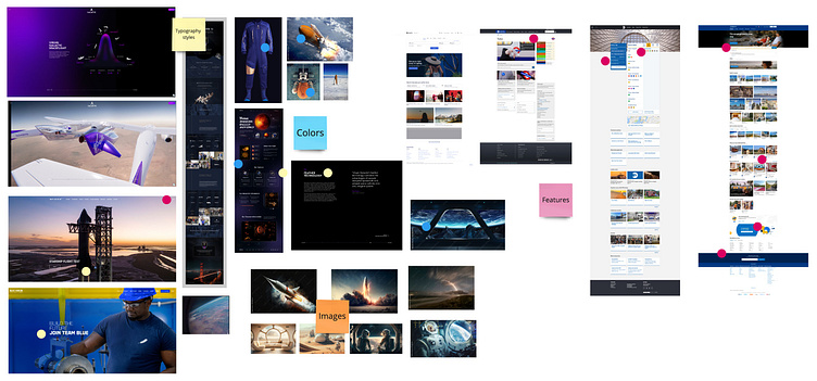
I started looking for a graphic line for the products. To do this, carry out a benchmark of websites related to space travel. The main ones were Space X, Blue Origin, and Virgin Galactic. Also, I searched for several space-themed images in Adobe Stock.
I took screenshots of Expedia, Booking, MTA, and London Underground websites.
I used Miro to evaluate and took some notes and insights.
As the last step, I played with Chat GPT, asking from the structure of a booking site for data such as the distances between the planets, the pressure in the cabin of a space capsule, the temperature of space, generated lists of spaceship names, etc. Chat GPT was a great tool that helped me generate content with some consistency quickly.
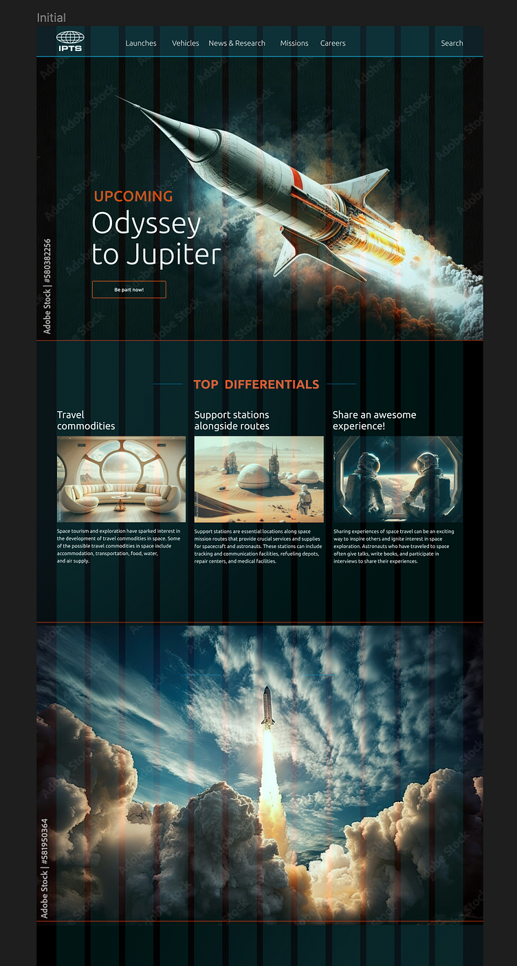
First Approach
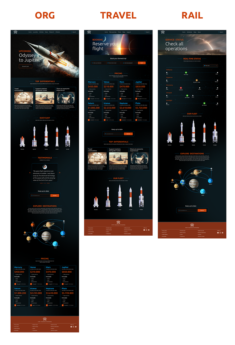
I focused on defining the aesthetics of the IPTS Org site. I did a quick mockup and then transferred everything to the other two products.
High Fidelity
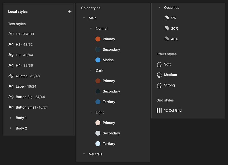
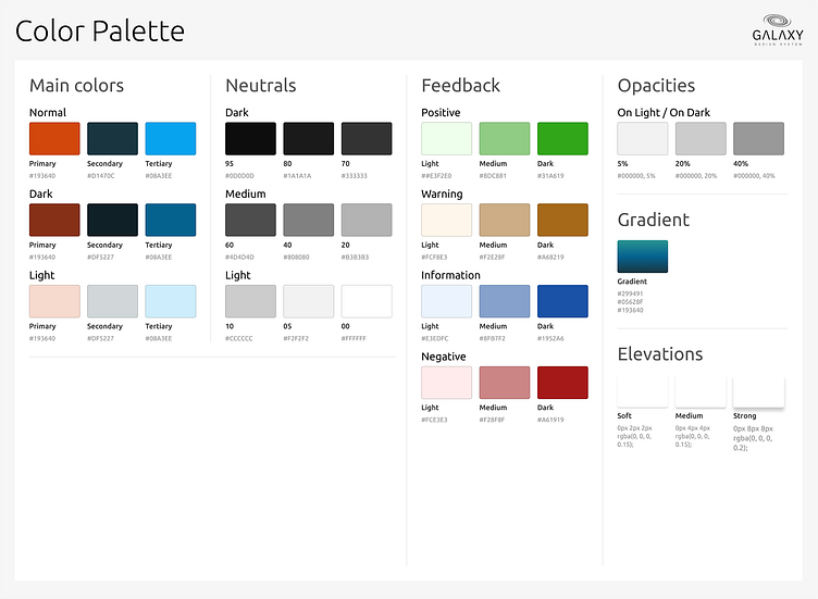
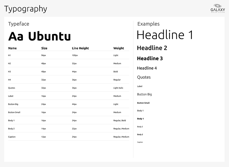
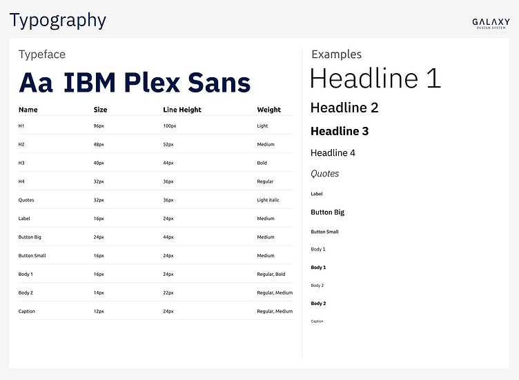
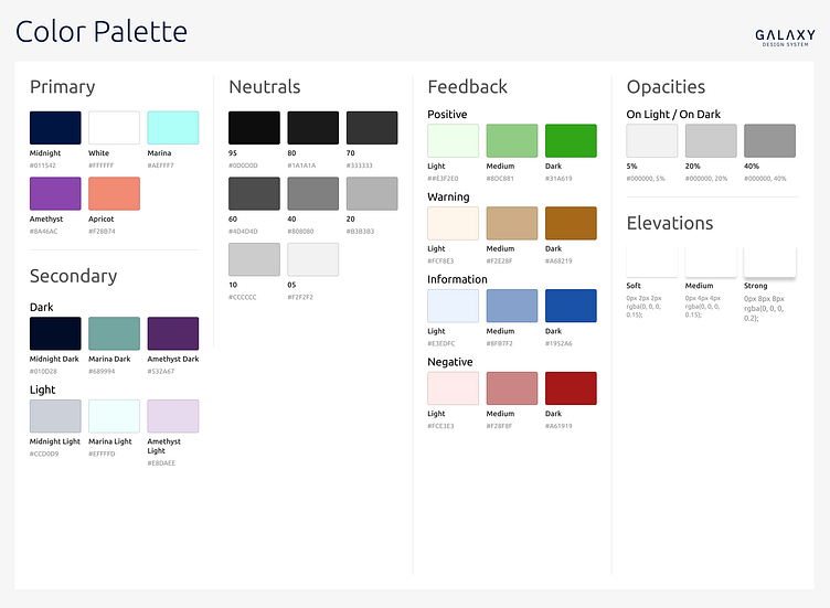
I defined all the local styles in Figma in order to save time and get consistency during the process.
Components
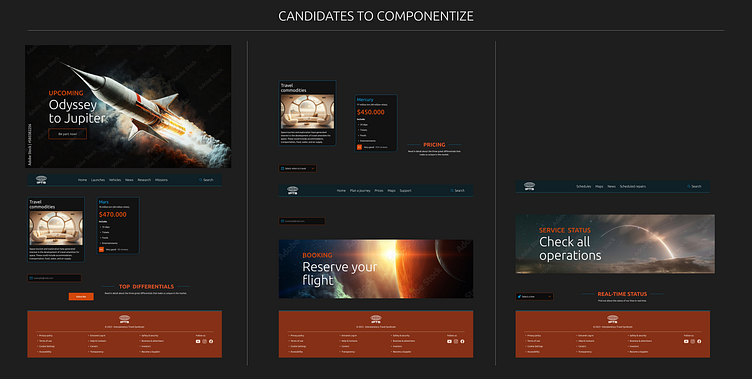
After I had defined three products, I extracted which components were candidates to build up as reusable components.
The Results
Below you can see the finished products, but if you want to go deeper, you can access the Figma
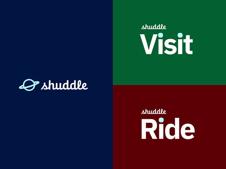
The Pivot
Your leadership at the IPTS—the Interplanetary Travel Syndicate—just hired the prestigious branding firm MegaBrand to do a rebrand of the entire organization, and there are a few things that’ll affect the three products you’ve been working on.
MegaBrand discovered through focus groups that the IPTS name and logo felt very ominous, like it was cold, faceless corporation that was always watching. (“The eyeball-shaped logo doesn’t help,” said one candid participant.) In addition, the IPTS wants to appeal to a younger demographic.
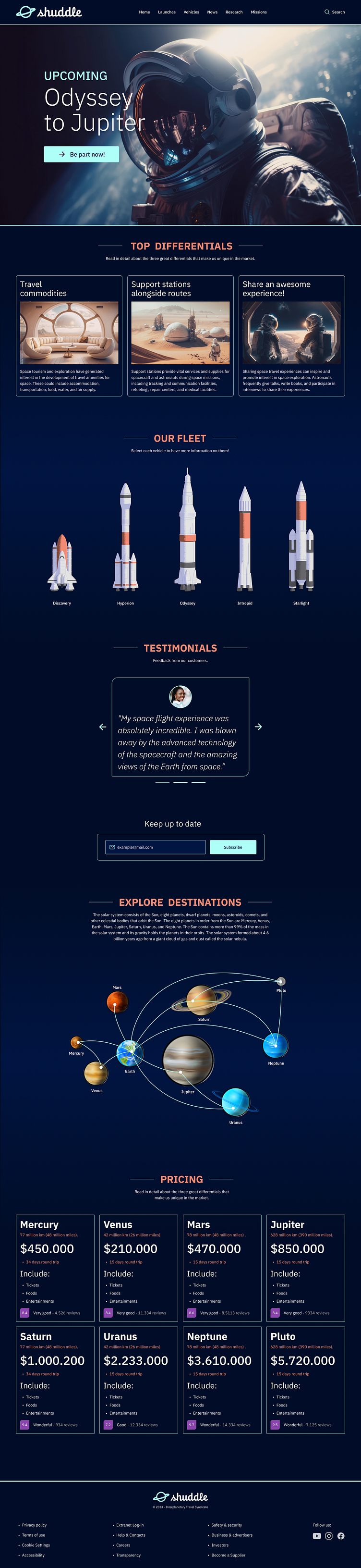
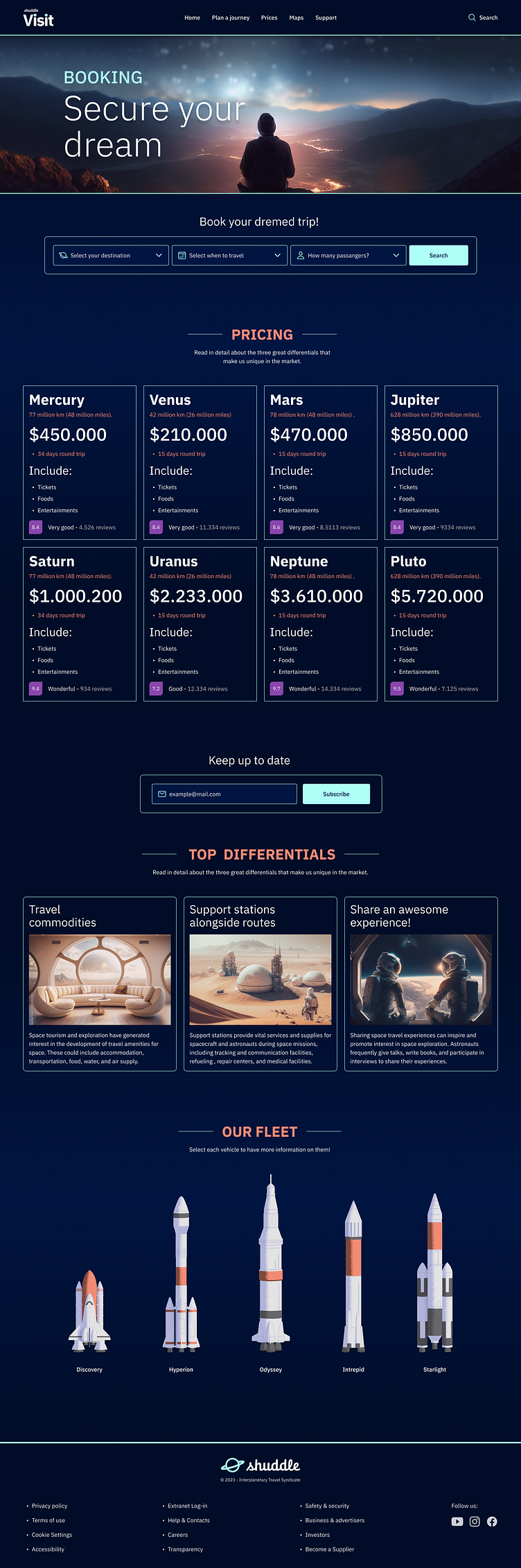
After weeks of research and exploration, they’ve settled on the new name “Shuddle,” which feels more like a cool, new startup.
Initial adjustments
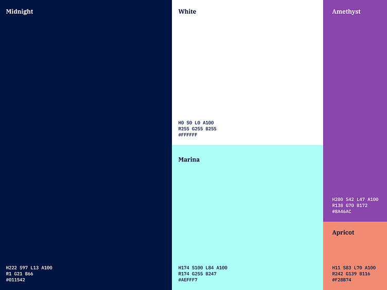
The first thing that was done before the brand change was to update the bases, changing the colors and the typography.
With these changes alone we noticed some changes, but one of the most noticeable was that the dark backgrounds no longer work well, in some cases with serious accessibility problems due to the contrast ratio.
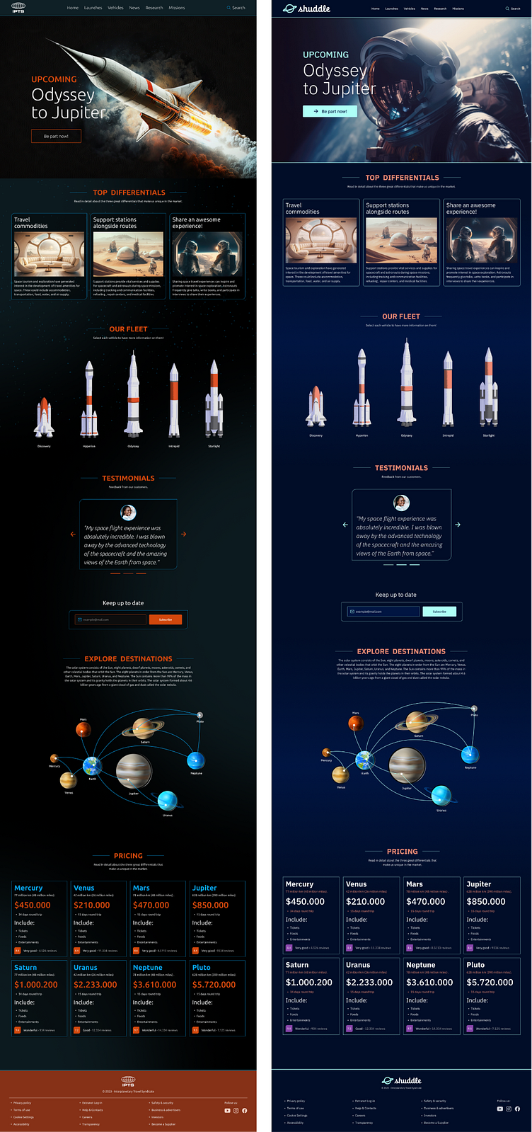
After making a radical change to the backgrounds and a few more small tweaks...Voilà!
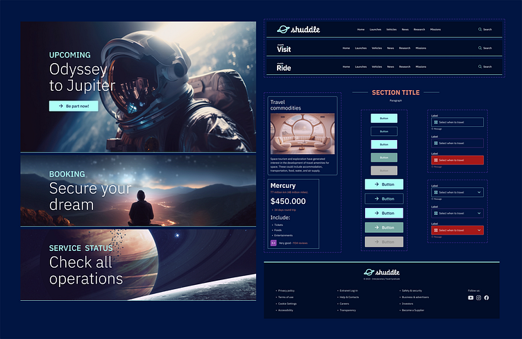
Re-branded products
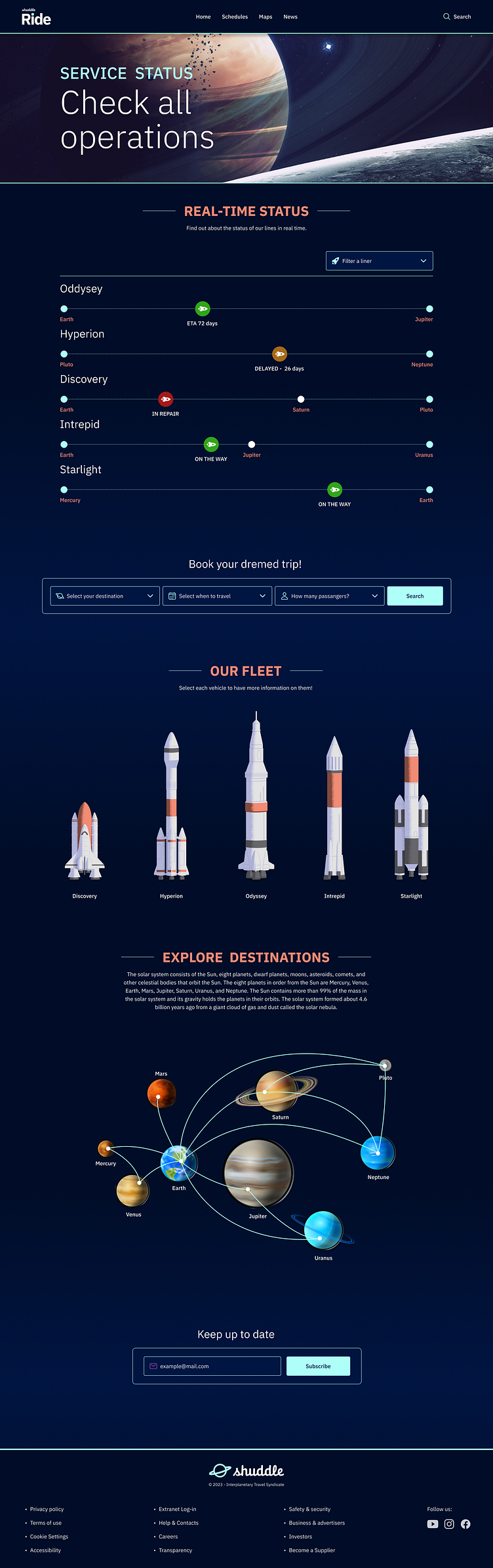
Also, you can access the Figma file of course!
The Galaxy Design System has been updated!
Components
Before / After
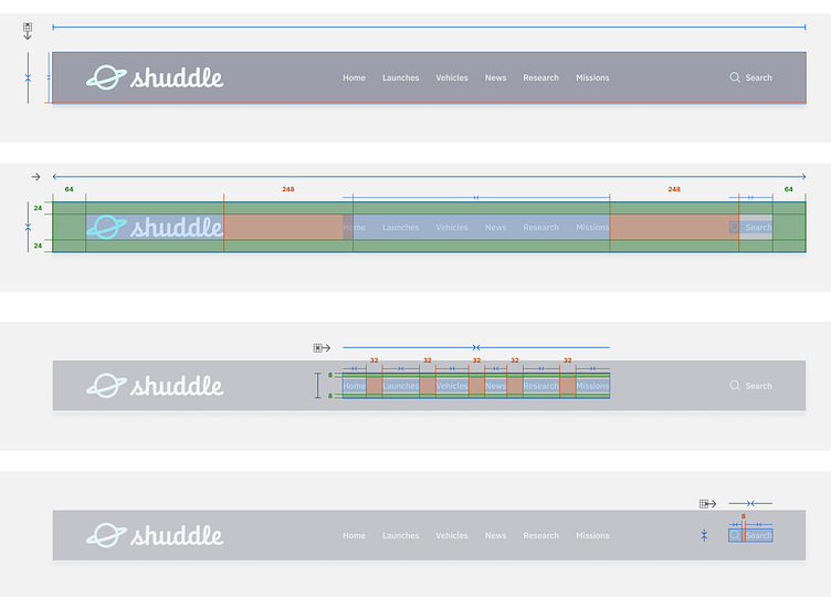
Reference website
To see more detailed documentation about how should develop properly the components, you can check this link up: https://zeroheight.com/77bfdef18 with documentation related to styles, components, layout, etc.
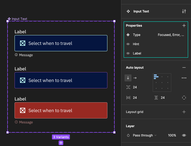
Variants and properties to build-up components
Takeaways
After this long journey, I have incorporated several lessons.
Thinking about scalability from the beginning will help us face future obstacles, sometimes unexpected, that can take a sharp turn and will save our customers a lot of headaches, time, and money.
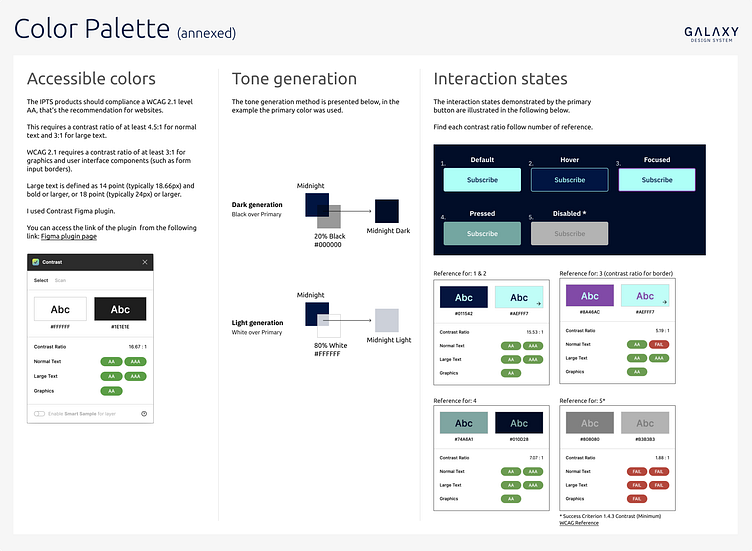
The importance of accessibility when we define colors. If we did a good check from the beginning we can quickly arrive at good and accessible solutions in terms of contrast ratio.
An interesting lesson learned was the possibility of mixed-up variants and properties build-up components in Figma, which saves too much room and you can ship more easy-to-understand and ready-to-use components.
The importance of not waiting to have everything defined to start building a design system. The 80/20 rule is a very good method of approaching a system. Also, do not leave the documentation for the last. It is better to follow a chronicling of what we defined in terms of Styles, Components, etc.