Pediatric Dentistry & Orthodontics - Web Design
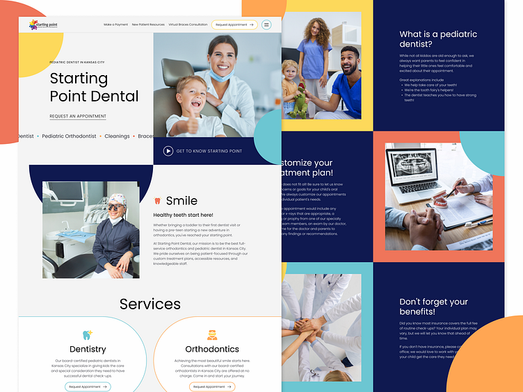
When it comes to custom-designing websites for brands speaking to parents, there's a fine line between childish and child-like.
The goal of the Starting Point Dentistry & Orthodontics website was to walk this line gracefully and confidently. While the branding appears youthful—utilizing a bright and playful color palette, modern and inviting typography, simplistic shape imagery, and more—the story and the content provide a warm, yet authoritative tone to help guide and educate parents on making necessary decisions on their child's dental care.
In addition, we also added smooth animations and easy-to-read poppy layouts to improve visual interest and increase user engagement.
Made with 💜 in Kansas City
Website / Get a Quote / Instagram / Clutch
More by Lifted Logic View profile
Like
