Case study: Shuddle Design System (Scaling Design Systems)

As part of the Scaling Design Systems course run by Dan Mall we were tasked to create three unique sites, at least one screen, for a fictional interplanetary travel company and its sub-brands. Powering these three sites would be a design system which we would need to create from scratch with its own documentation site chronicling our design decisions.
The second part of our task involved an inevitable plot twist where the company went through a complete rebrand. This really put our design system to the test, particularly in its success (or failure) in handling a rebrand.
The following case study documents that process.
Starting from product
A great takeaway from this course, and my many years experience working in product design, is that the first step of any design system is to actually have a product to create one from.
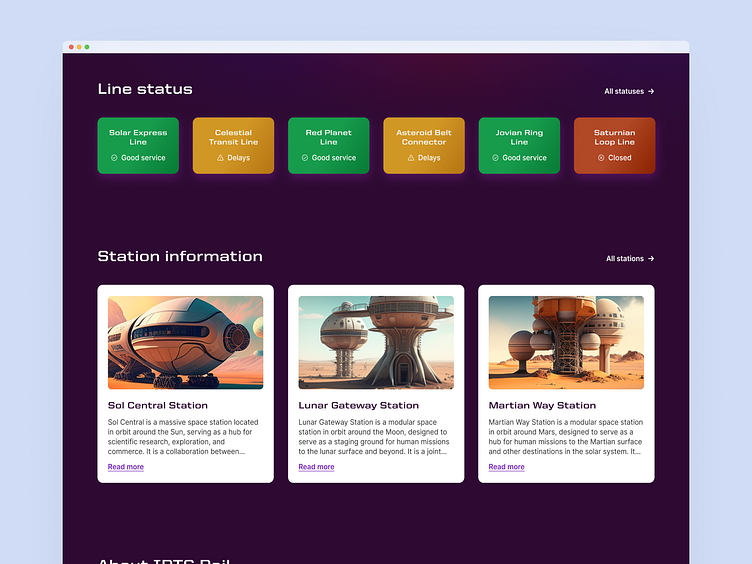
Given the fact I was a one-man-band for this task I used ChatGPT to help form a skeleton layout for each sub-brands homepage using an intentionally bright and ugly placeholder. This actually ended up becoming my very first component in my Figma library as I was naturally reusing it as I built up each screen.
Colour and typography
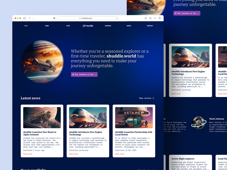
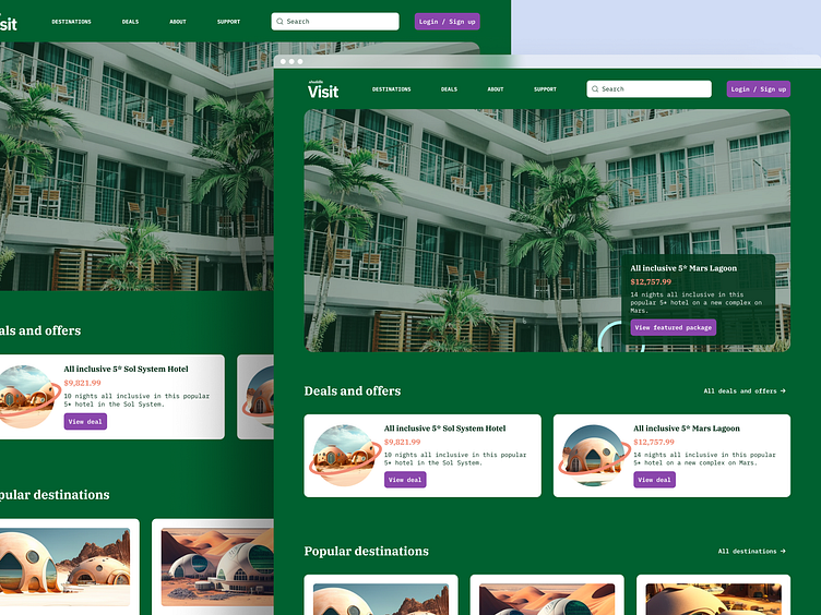
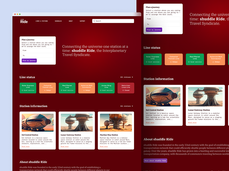
Now that I had a starting point for the structure of my sites I could start playing around with creating the homepages for each of the sub-brands. I settled on United Sans with its futuristic/freight/hauling feel for headlines and Inter as a simple, un-opinionated body text. This type choice covered all brands to create some commonality.
Given that I wanted each sub-brand to have its own unique look and feel I decided that they would each have their own colour palette — in the back of my mind I knew this would be an interesting approach when it came to building out a design system and creating some kind of theming model.
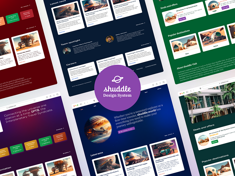
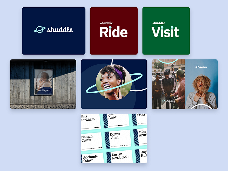
Layouts settled
Leaning on ChatGPT and Midjourney to create content and images for each of the sub-brands I settled on the following layouts — first stage complete I now had the products to start creating a design system around.
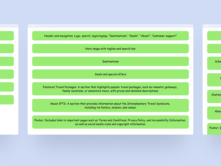
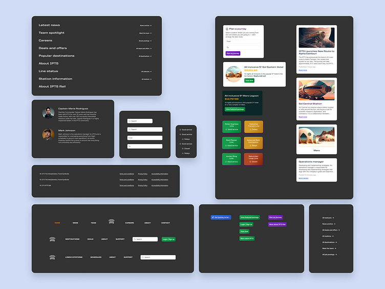
Visual inventory
With any design system commonality is a good starting point to figure out where shared components would be most useful. Using a visual inventory, I collected all similar UI elements together, bucketing them under themes, and then stack-ranked them from most common to least.
The most common I started working on creating components for first and then moved down the list until I had multiple components for each theme.
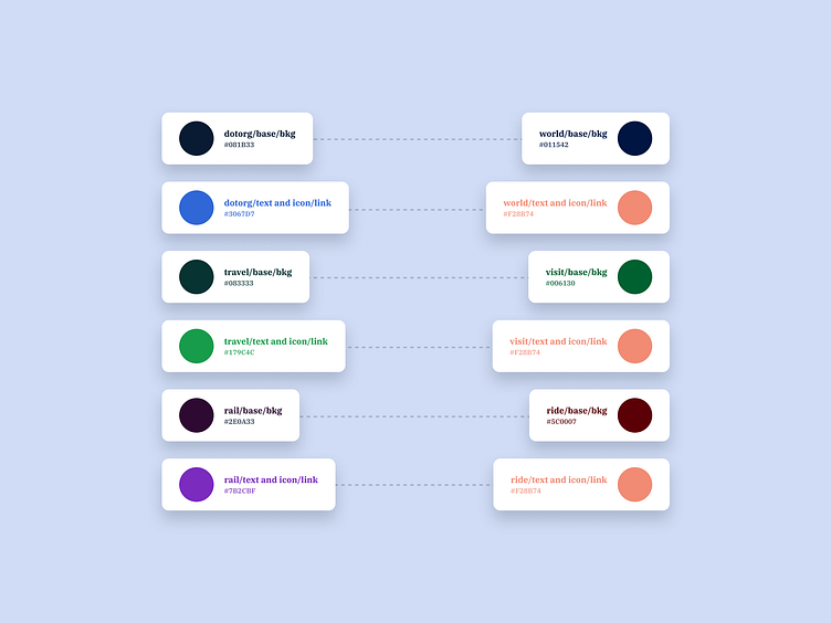
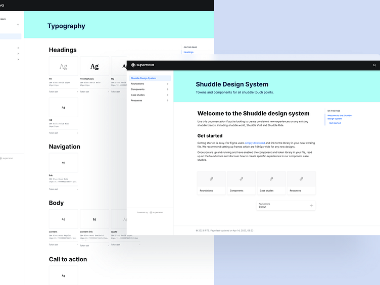
A note on tokens
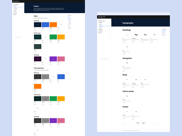
After creating a few components it started to become tricky to see how colour and typography styles would link up. I focussed on putting together a token model for type and colour at this point.
Typography tokens were pretty straight forward to put together as type was the same throughout each sub-brand. Colour tokens were harder to form as I wanted to maintain a theming model. The model I landed on was theme Name/type/style. So for example the background of a button component for the sub-brand IPTS Visit would be visit/button/bkg.
I then started documenting on Supernova to create a source of truth for the token model.
Chronicling, not documenting
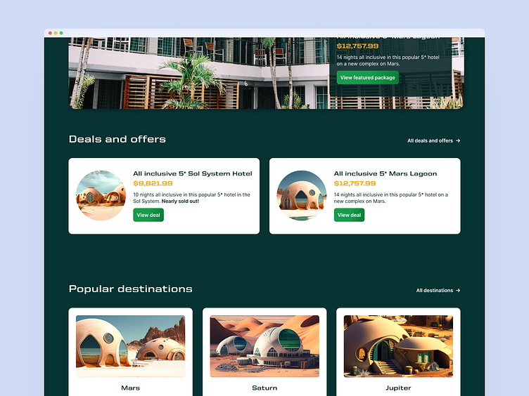
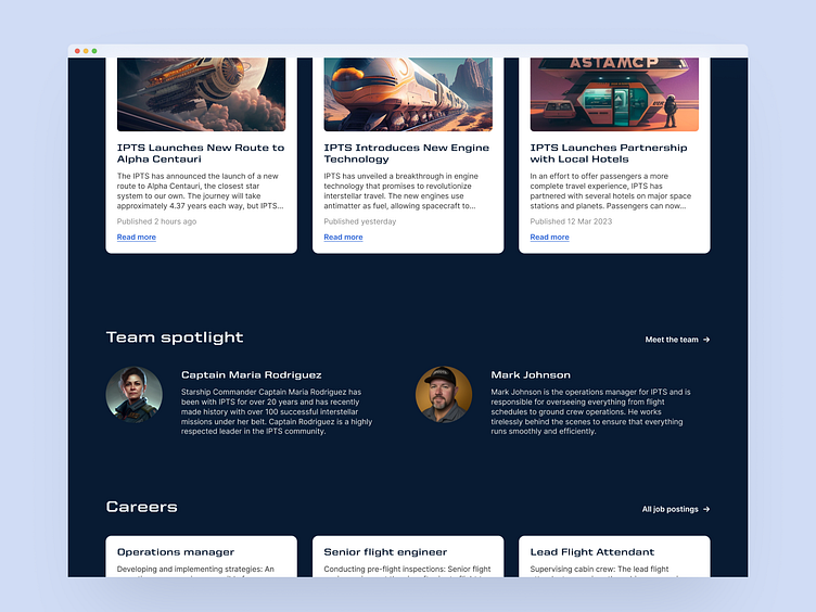
With my components and token model all in place I recreated each screen using the new design system. It’s worth noting that not everything needs to be a component or sharable — the design system is there to serve a purpose so with the hero sections of each of my designs they were very different — they may have used tokens and some components but they were intentionally bespoke.
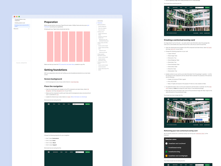
As part of our design system documentation site we were tasked to chronicle how to form a page so if another designer wanted to create one they could learn from my successes building with the library. I decided on chronicling three different areas where I felt would be the most difficult if someone were to pick this up without prior knowledge. They were:
Changing themes
Creating a planner card
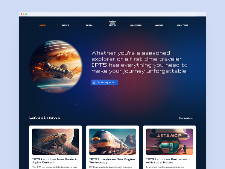
Creating a home screen for IPTS Visit
The inevitable rebrand
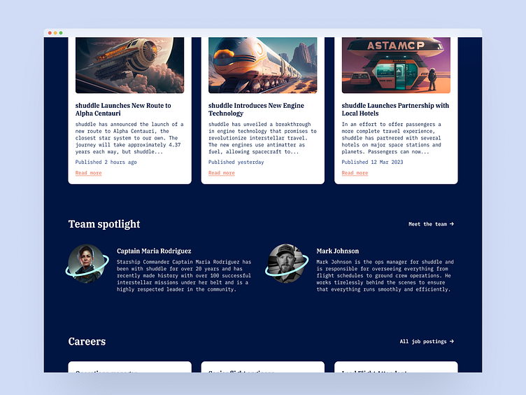
Putting the design system to the test we were tasked to go through a rebrand exercise and were provided with new names, logos, colour schemes and assets to work with.
To start, I duplicated my Figma library and named it rebrand while relinking all my components in my designs to the new library.
Updating tokens
My first port of call was to update the token model. I updated all headlines to use IBM Plex Serif and body text to use IBM Plex Mono. This was a pretty straight forward swap in and out and looked pretty good on each of the sub-brands.
For colour I decided to update the naming convention to match the new sub-brand names and I began updating the colours to the new rebrand palette. There was a bit of back and forth getting the colours feeling well balanced on the designs but overall the palette held strong and I didn’t have to make any drastic changes.
Adding rebrand flourishes
The rebrand came with some flourishes like rings around images which added a bit of a playful planetary feel. I decided to include these in my card components to add some more brand details to the designs.
Updating the documentation site
Updating Supernova to reflect the new brand was a pretty straight forward exercise, especially when you can link your Figma library and it updates tokens more or less without any input from the user.
Closing thoughts
Overall I really enjoyed taking the lessons from the Scaling Design Systems course through to a working design system and learnt a bunch along the way, primarily around processes and activities you can do to get value and adoption early.
With this project in particular my biggest hurdle was around creating theming tokens in an efficient way — this is hard and there is no one solution that works for all problems, but its something I’ll be wanting to learn more about.
I really love one school of thinking about the intent of design systems, and its something I intend to be practicing more of, which is that a design system does all of the boring work for you — it leaves you and your team with time to work on coming up with creative solutions for product problems.