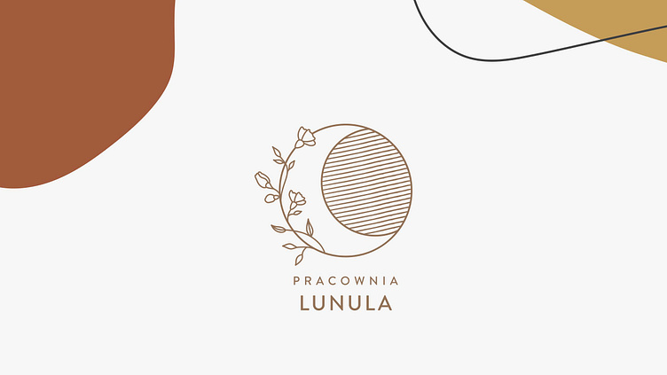
Pracownia Lunula branding
The word lunula means a medieval Slavic decoration in a shape of crescent, which was considered a symbol of femininity. It was also believed that lunulas protect from curses and help win the gods' favour.
The client asked me to use the crescent motif in her logo, and also to highlight the femininity, subtlety and gentleness of her studio.
For the whole branding, she wanted a calm pallette of warm earth tones accompanied by organic, abstract shapes.
More by MAVI Magdalena Witczak View profile
Like


