Redesign for Bespoken by Spoke Design Labs.

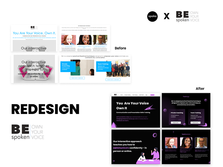
Based on the ongoing series by Spoke Design Labs, we conducted an audit for BESPOKEN and discovered areas that could be improved to enhance the user experience.
As a result, we have devised solutions to address these issues.
Let's roll? Here we go,
Areas of challenge and our approach to the solution:
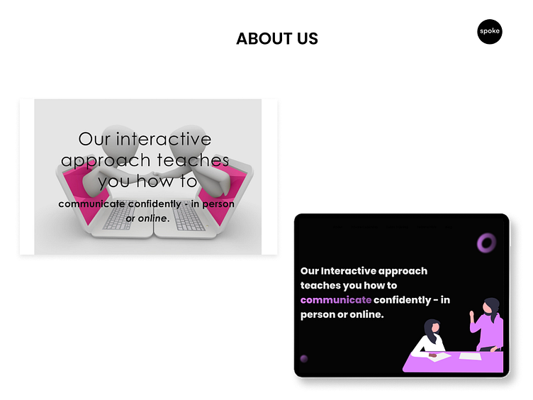
Issue 1: The website's hero section lacked consistency and sophistication, negatively impacting its overall visual appeal in terms of images and typography.
Solution: We recommend a modern, stylish dark theme for the hero section, including high-quality images and consistent font usage for improved legibility. This will enhance the website's overall visual appeal, increasing user engagement and exploration.
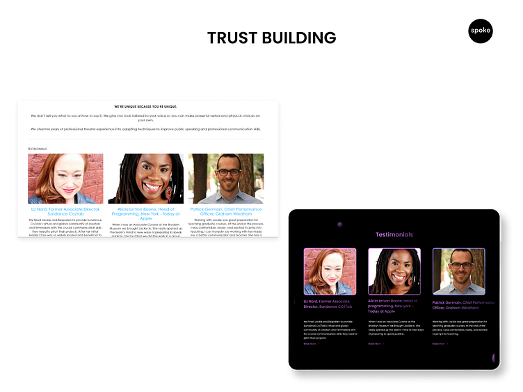
Issue 2: The presentation of testimonials on the website was disorganized and challenging to read, which made it hard for users to appreciate them.
Solution: Improve the presentation of testimonials by using a consistent layout, clear headings, and relevant information such as name and position. Feature them prominently on the homepage and create a separate page for showcasing customer feedback to increase accessibility and user engagement, leading to a higher likelihood of users being convinced of the platform's value and taking action.
Takeaway: Overall, our UX audit has identified key areas where the website could be improved to enhance user engagement, and we have implemented design solutions to address these issues.
Want to explore more of our work? Click here. ;)