Doss - Inbox
Hi there,
I am happy to share a case study for the inbox page we designed for Doss (previously Odonata).
What is Doss?
Doss is building an Adaptive Resource Platform (ARP), which serves as a record system for companies with physical operations. It’s an alternative to traditional ERP (Enterprise Resource Planning) software, allowing companies to onboard within minutes, without the need to implement, debug, and without huge set-up costs. Doss integrates with the operations tool stack like Shopify, Flexport, ShipStation, Xero, or Quickbooks.
How we helped
Doss had acquired funding and wanted to create an MVP prototype for their platform. They wanted to show their vision to the prospective customers they were talking to at the time. They knew that the vision for the product would likely evolve, so they were looking for ongoing support over an extended period, a design partner they could work with closely and that would implement feedback and insights from their customers to create the best product-market fit.
Challenge
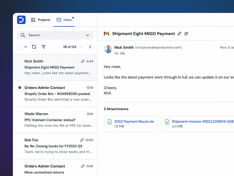
One of the user scenarios we designed was checking new messages in the in-app inbox and seeing if any actions were needed. The main challenge was creating a page that suggested the most relevant contexts and edits.
The aim was to automate this flow by fitting context to a message and letting users make edits immediately. Hence, users no longer need to manually check their messages and look for content that needs updating.
Doss uses artificial intelligence to suggest spreadsheet updates based on conversations. Users can easily select contexts and see proposed modifications. They can accept the edits by checking a box or opening a table to see a more contextual view.
–
If you're looking for a design partner for your next SaaS project, drop us a line, and let's talk about how we can help you achieve your goals.
📬 We're available for new projects. Contact us at hello@semiflat.com


