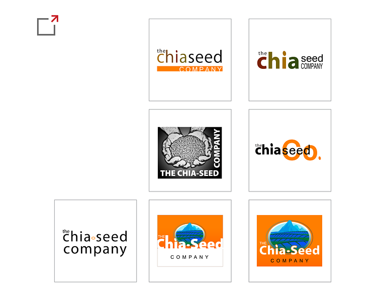
chia seed co.
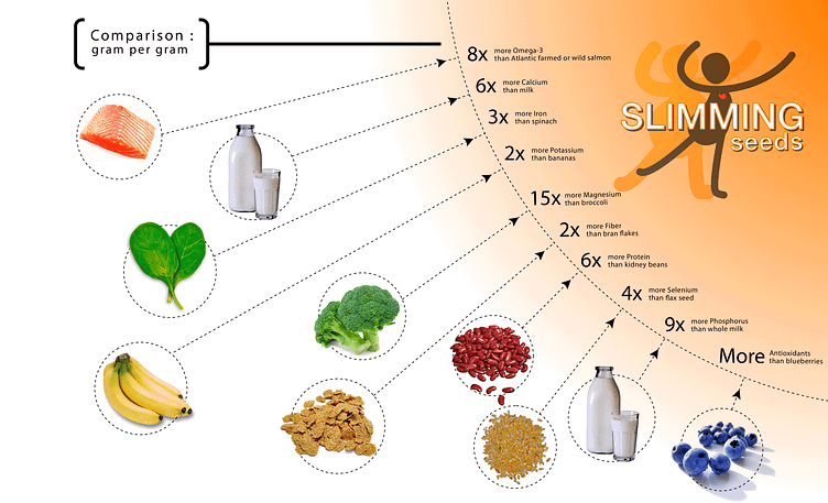
Undertook an exciting project: the creation of a comprehensive brand identity for Chia Seed Co. and their product "Slimming Seeds." As a leading provider of healthy and natural food products, Chia Seed Co. sought to introduce a specialized range of chia seeds targeted towards individuals looking to achieve their weight management goals. Our objective was to develop a logo, packaging, and infographic material that not only reflected the brand's core health benefits but also incorporated the requested color scheme of orange.
To begin, we embarked on a comprehensive exploration of the brand's essence and target audience.
Through extensive market research and consultation with Chia Seed Co., we gained valuable insights into the desires and aspirations of health-conscious consumers seeking effective weight loss solutions. Armed with this knowledge, began to craft a visual identity that would resonate with the intended customer base.
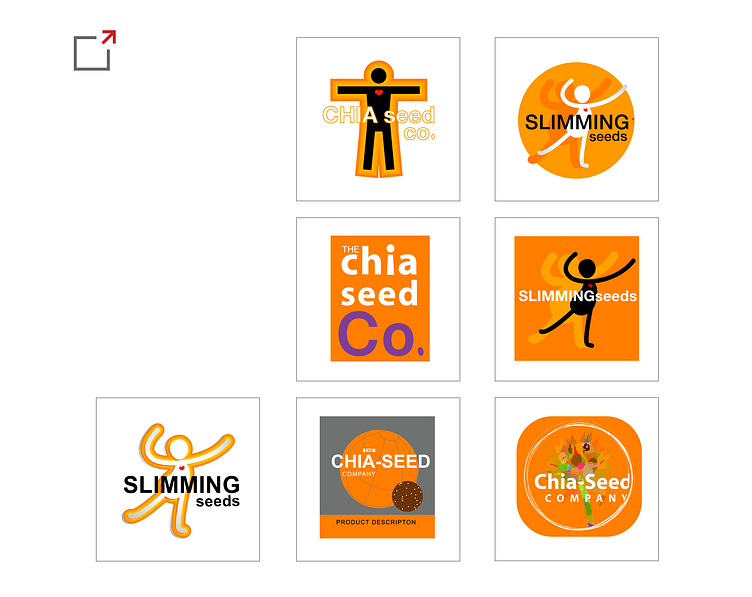
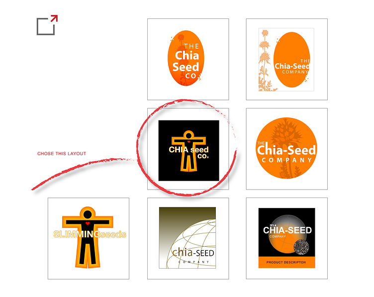
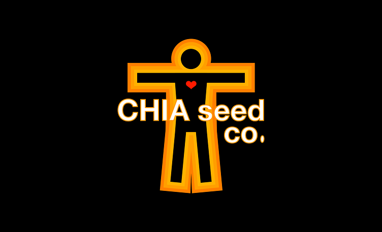
The logo for Slimming Seeds exudes energy and vitality. Combining the symbolic representation with an abstract, contemporary design, we created a dynamic logo that portrays growth, progress, and transformation. The choice of orange as the primary color brings forth a sense of warmth, enthusiasm, and positivity, perfectly aligning with the brand's message of natural, healthy weight management.
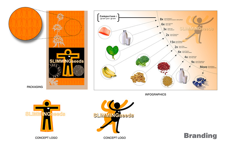
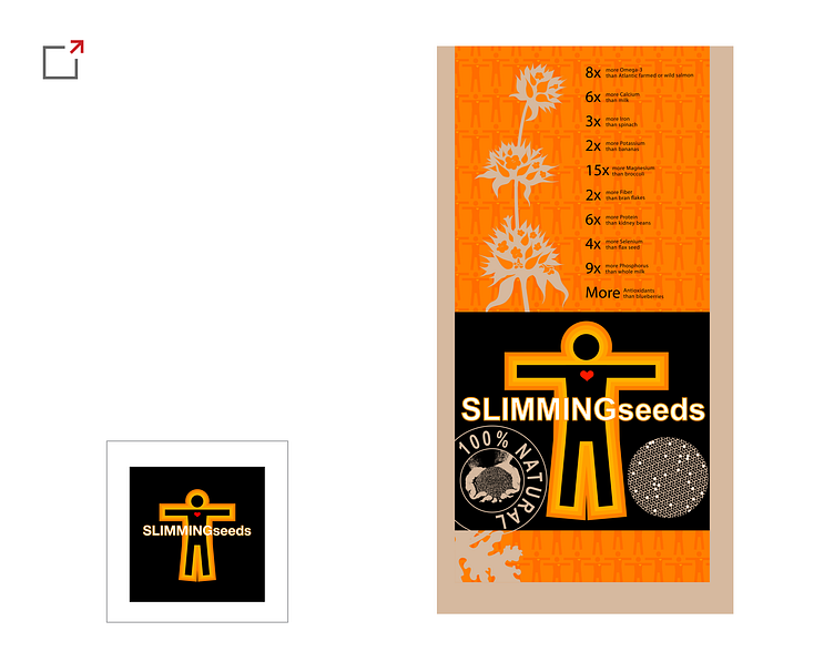
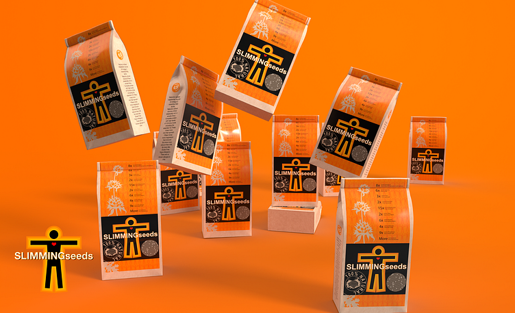
For the packaging, we aimed for a balance between simplicity and elegance. The design features a clean, minimalist layout, allowing the vibrant orange color to take center stage. Through careful typographic choices and subtle graphical elements, we ensured that the packaging communicated essential information while capturing attention on store shelves.
Overall, our design firm successfully delivered a comprehensive brand identity for Slimming Seeds that captures the essence of Chia Seed Co.'s new product line.
