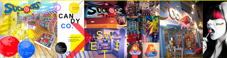
suckers candy co.
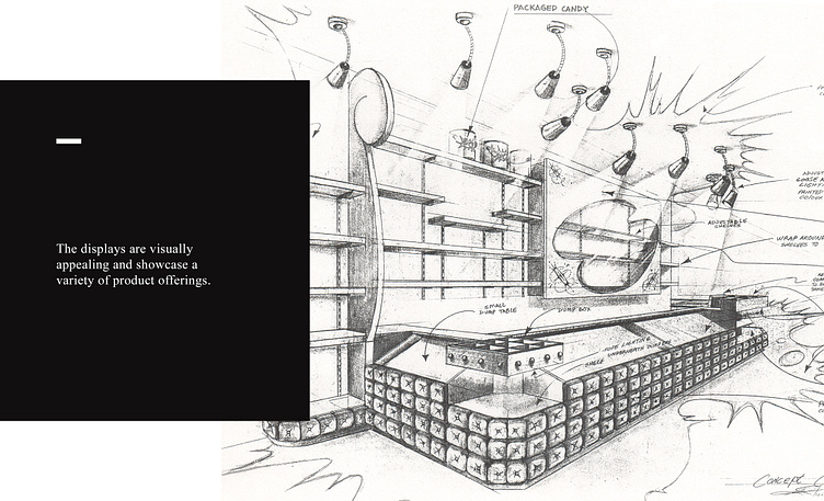
The Suckers Candy Co. branding project was a fun and dietary challenge. Our objective was to create a memorable and eye-catching branding strategy that tied an eye-catching logo and interior design together. It was important for the interior to be playful and interactive, encouraging exploration and discovery.
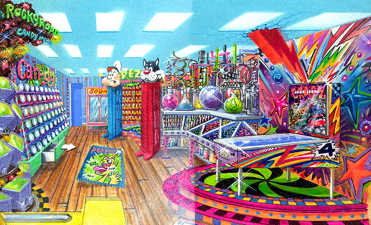
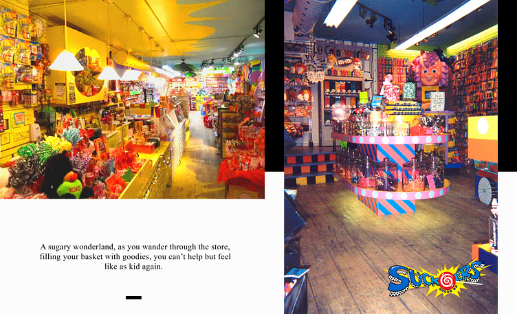
To do this, we used bright and bold colors throughout the store with playful displays to engage and entertain customers. The end result was a truly unique and fun space that captured the spirit of childhood nostalgia.
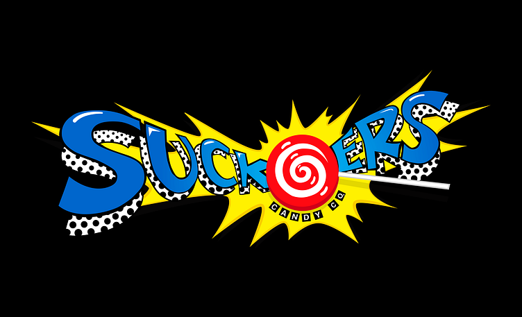
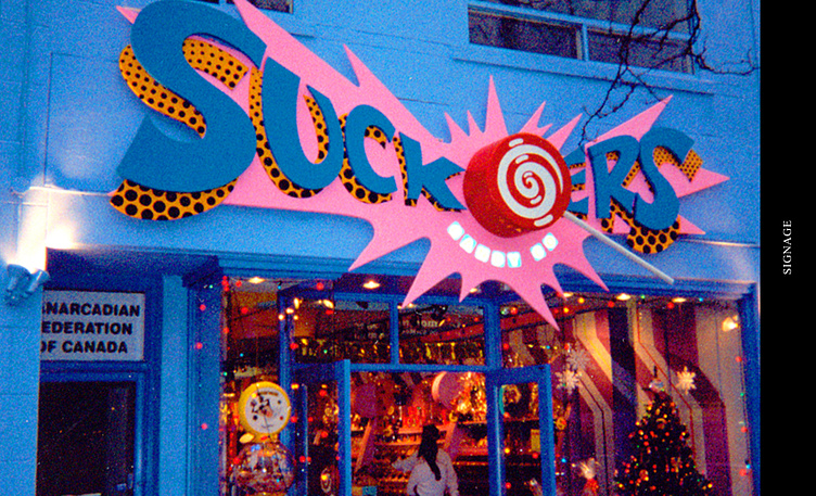
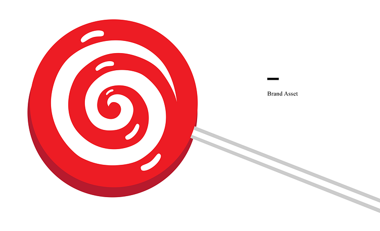
The original name for the store was Sugar Pop, but after we established the playful and whimsical interior design, we knew that the name needed a little more pizzazz. We wanted something that would catch people's attention and stick in their minds long after they left their doors. That's when "Suckers," was born, a name that perfectly captured the fun-loving spirit of the brand. And what better way to illustrate that spirit than with a 3D lollipop paired into the logo and signage?
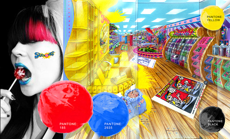
mixed media illustration
The interior and logo design for their flagship store was such a hit that the customer expanded into Famous Players Theatres and six more doors.
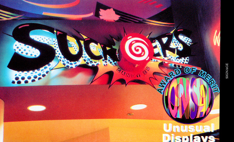
We are thrilled to have been a part of this successful expansion. The candy stores exude an exciting atmosphere with bright colors, playful patterns, and whimsical décor. The Suckers Candy Co logo is prominently displayed throughout each store, catching the eye of every passerby. It's truly rewarding to see customers leave happy with their treats in hand.
