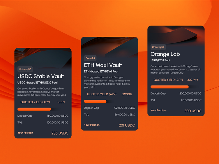
Orange Finance - UI
Hey, Creators!
From a communication perspective, our key challenge was to distill the complex mechanics behind Orange into an easy-to-understand narrative for all web3 users.
In designing the logo, the team drew inspiration from the brand name. Simple but elegant, a circle was adapted with one quarter reversed to form the appearance of an orange with a stem. In the larger format, the logo is set upon an orange circle to striking effect.
The full case study can be found here. 👈
━━━━━
Love 🧡 our shot? Press “L” to support us!
Want to see more? Check out our website! 🌎
Connect with us on Facebook | Instagram | Twitter | LinkedIn
More by Zypsy View profile
Like
