UI: Redesign Apple's add alarm feature on the clock app
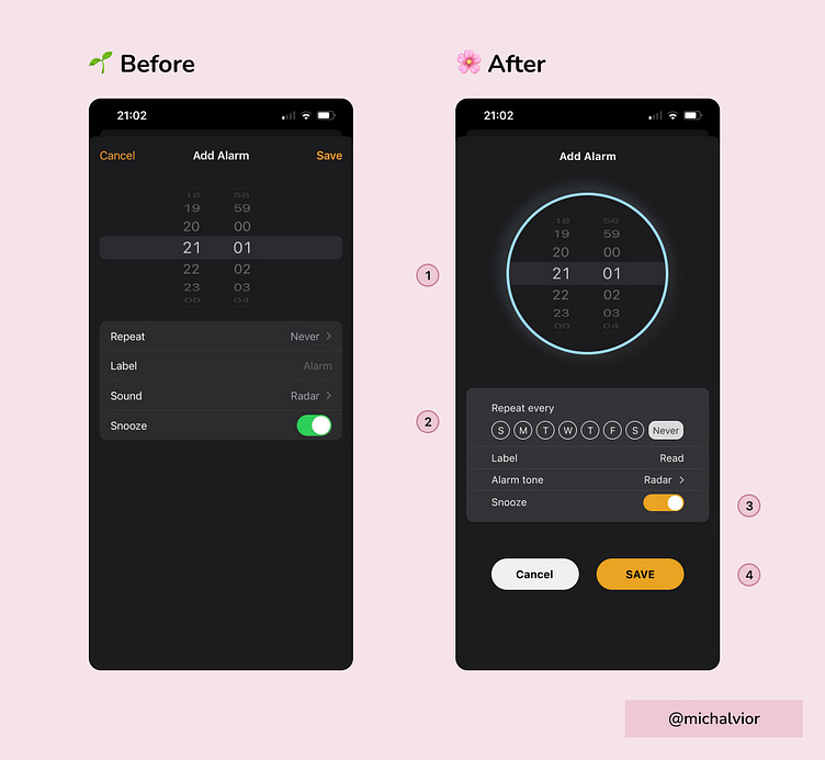
I designed the analog clock with added stroke color that changes to blue for night and yellow for day, depending on the time set. This additional feature enhances accessibility, making it clearer for users to see the time they're setting for their alarm.
By incorporating these visual cues, you're providing users with a clearer understanding of the alarm time, which improves the overall accessibility and user experience of your product.
Instead of using a drop-down menu, I changed the way we display the days by listing them horizontally. This makes it easier for you because you don't have to click as much. You can just look at the days laid out in a row and pick the one you want. It's a simple and user-friendly way to choose the day you need without any extra hassle.
I keep the color branding consistent for the snooze on/off feature.
Lastly, I placed the cancel and save at the bottom to make it more visible That's a wrap! My first attempt on redesigning a page on an app Will post more this coming weeks
Tools: Figma