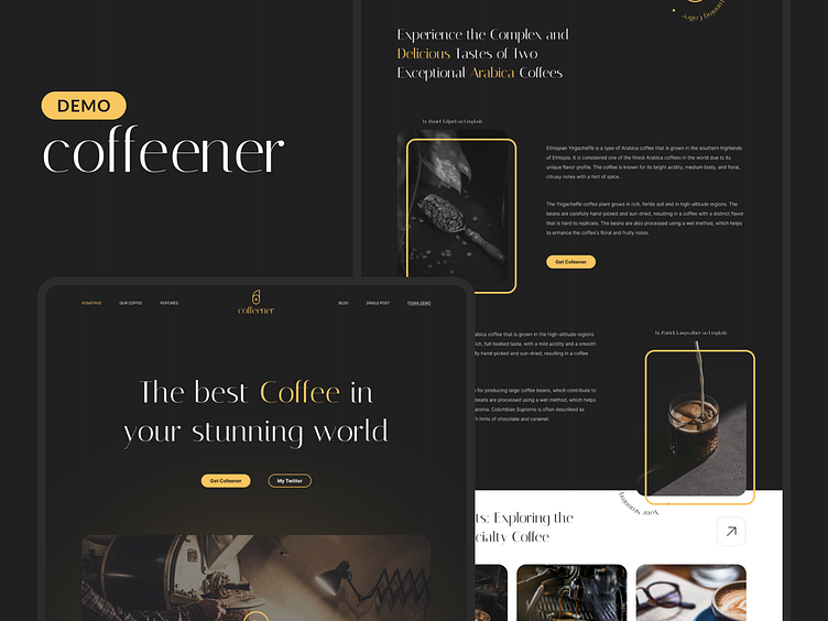
Coffeener - landing page design
The design includes an eye-catching banner on the homepage, highlighting the main advantages of the coffee being sold. There is also a dedicated section showcasing the different types of coffee available, along with descriptions and customer reviews. Additionally, there is a section for feedback where visitors can leave their contact information and questions regarding the products.
Each section of the page is designed with a clear and concise structure, making it easy for visitors to navigate and find the information they are looking for. The color scheme and typography have been carefully selected to complement the overall design concept and create a unique and memorable user experience.
If you are interested in purchasing the template for use on the Framer platform - you can do it here.
This is a demo version of a landing page design created for the purpose of showcasing a coffee sales website. It has a fresh and stylish look that is designed to capture the attention of visitors. Please note that this is not a full website, but a demonstration of its layout.
You can find this template in the Figma Community.


