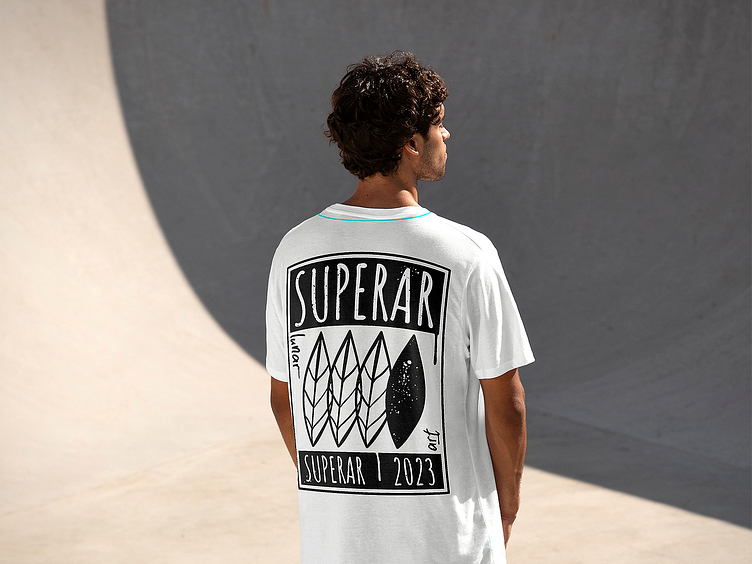
Superar T-Shirt Design
For this t-shirt design project, I created a minimalist design that combines four leafs arranged in a way that mimics tribal battle shields. The use of black and white colour scheme adds to the design's simplicity and rawness.
To achieve the gritty and urban feel, I incorporated a series of distressed lines and rough textures that give the design a worn and authentic appearance. The overall effect is a design that feels like it has been through some battles and carries with it a sense of toughness and resilience.
I chose to present the four leafs in this way as a nod to the brand's ethos of strength, protection, and community. The minimalist design ensures that the message is subtle but powerful without being overwhelming or distracting.
The t-shirt design was created in vector format, allowing for easy scaling and adaptation for different products and marketing materials. The simple yet powerful design ensures that it will stand out and make a statement whether it's worn by skaters, urban fashion enthusiasts or anyone who appreciates edgy and minimalist designs.
Overall, I'm thrilled with how this project turned out, and I'm confident that the final design is a powerful representation of the brand's values and aesthetic.
