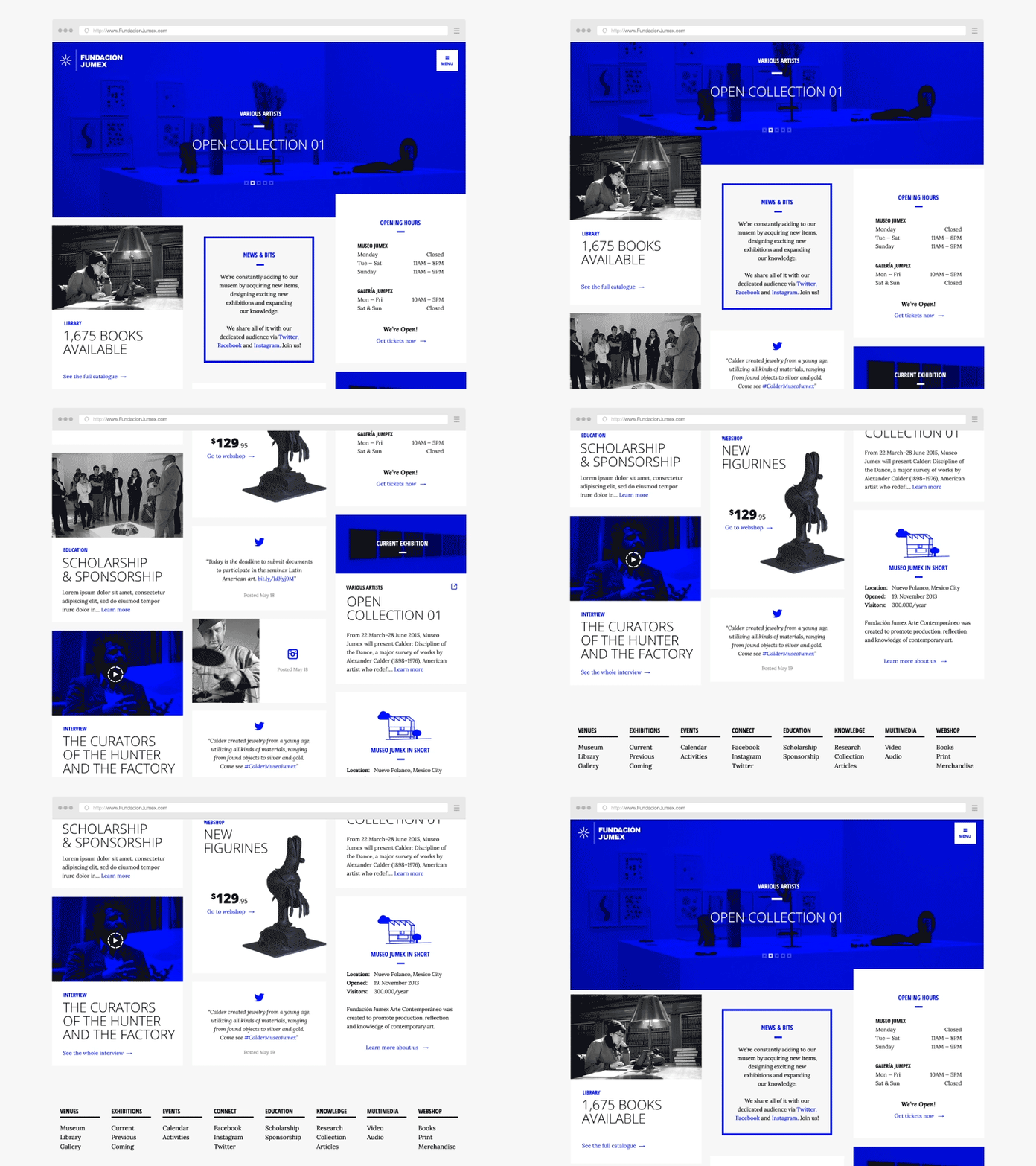
Hierarchy through parallax
A concept I did for a pitch recently. I came up with this way of creating hierarchy in the large amount of content that needed to be displayed on the front page.
It's based on a three column grid, where the left column houses not-so-important content, middle one houses semi-important stuff, and the right column has the most important stuff. So as the user scrolls down the site, the most important stuff stays the longest time in the viewport. What do you think in terms of the user experience?
Pixels attached
More by Mikael Waaben Blædel View profile
Like

