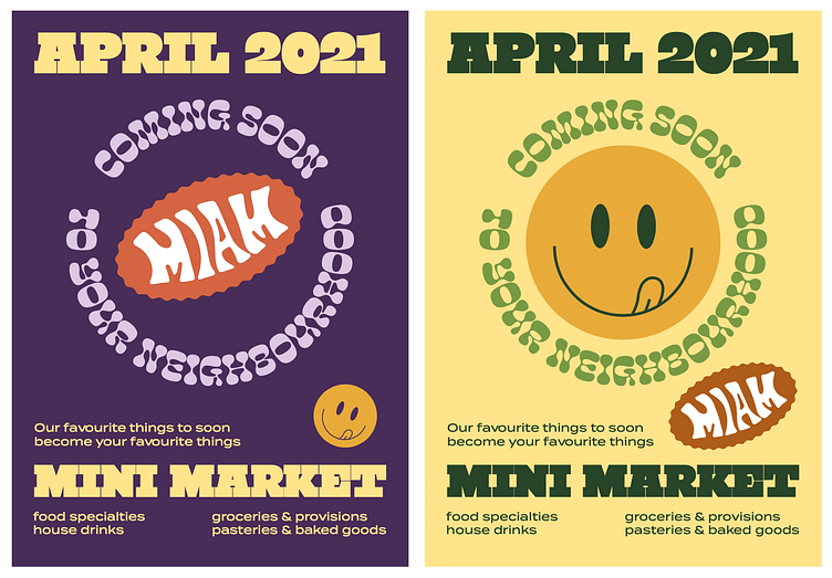
Miam brand design
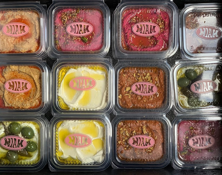
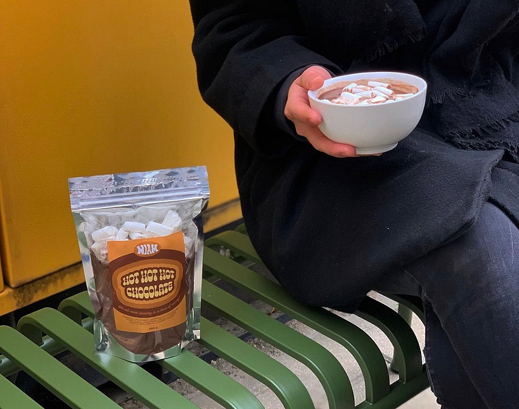
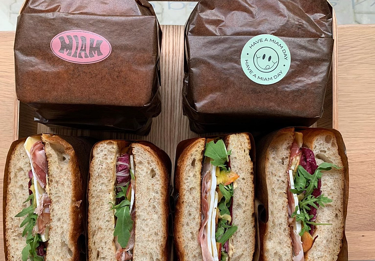
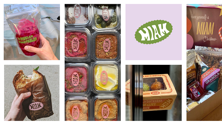
Miam are a catering company based in Sofia, Bulgaria. They are known for their funky, unique and delicious food and are invited to cater at most major events. After a few years they decided to open a mini market and make some of their signature products accessible for everyday lunch, like their signature ini burgers and some of their shelf products like sauces, pickled veggies and granola.
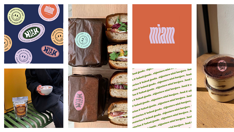
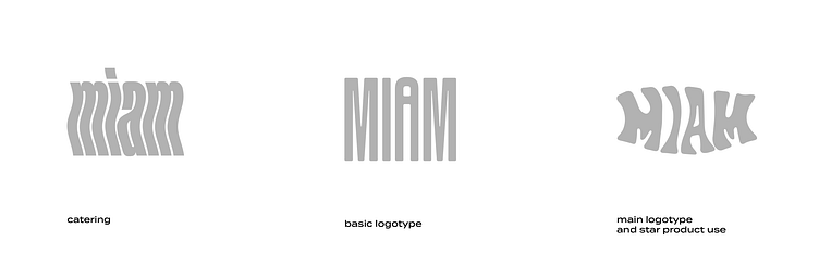
the logotypes
Since they were starting an additional business rather than transforming their existing one, we decided it would be best to distinguish their three brand branches with three different logotypes. One for catering, one for their everyday lunch products like salads and sandwiches, and a final one acting as their main brand image logotype, used on star products, store windows, product stickers, bags, etc.
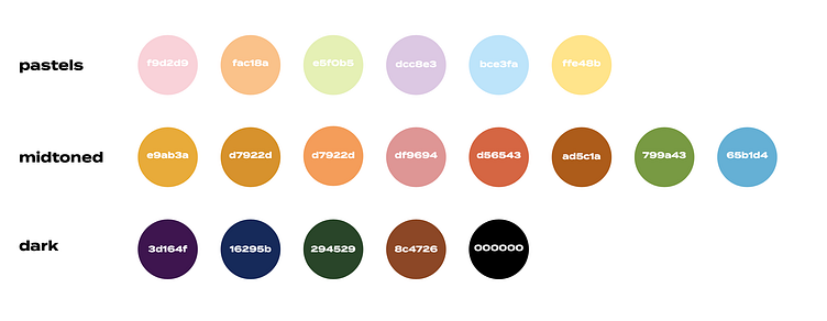
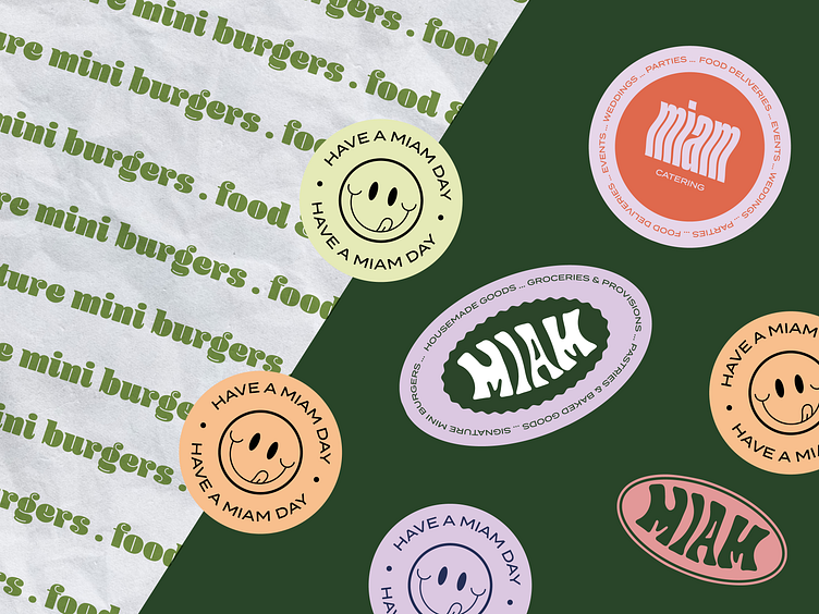
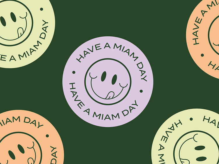
the 'no palette' palette
Miam's owners get bored way too quickly. They are also fans of raw design, things that look awkward together and stand out. That is why the brand palette isn't a traditional one and contains many colors. Additional colors can be added if needed in upcoming new product packaging. There is one thing to be respected, a combination of bright pastels for the lightest shades, toned down midtones and dark colors to be included in order to provide contrast.