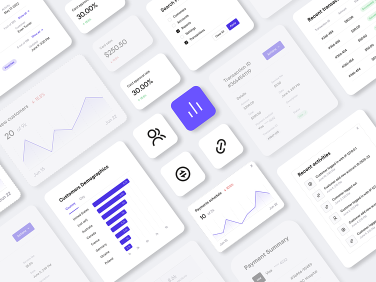
Design parts for a digital debt collection platform | Lazarev.
What's up, Dribbble community!
We've got a new shot for you, showcasing our latest UI/UX design project — a digital debt collection platform with the sleekest B2B SaaS design out there 🔥
In this episode, we're honing in on the nitty-gritty details of our SaaS design. 'Cause Leonardo da Vinci once said, "Details make perfection, and perfection is not a detail." And we're all about that perfection, you dig 😉
Check out these widgets' design, complete with vibrant typography and smooth gradients, self-explanatory icons, and graphs to give users easy access to all the necessary analytics. Love them?
But here is what we wanna emphasize on ☝️ these design elements aren't just for show, though, they're all about maximizing functionality and providing a seamless UX.
So enjoy the shots and let us know if you're feeling our vision that design isn't just about looking pretty, it's about making a real impact on the business.
And if you're thirsty for more design insights, head on over to our socials. We'd be happy to connect with you there too.


