Marc Wyer Logo Design
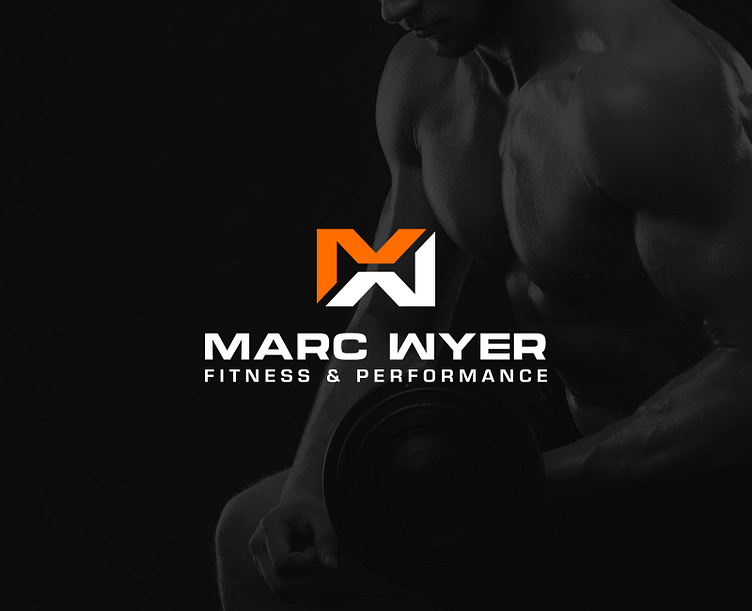
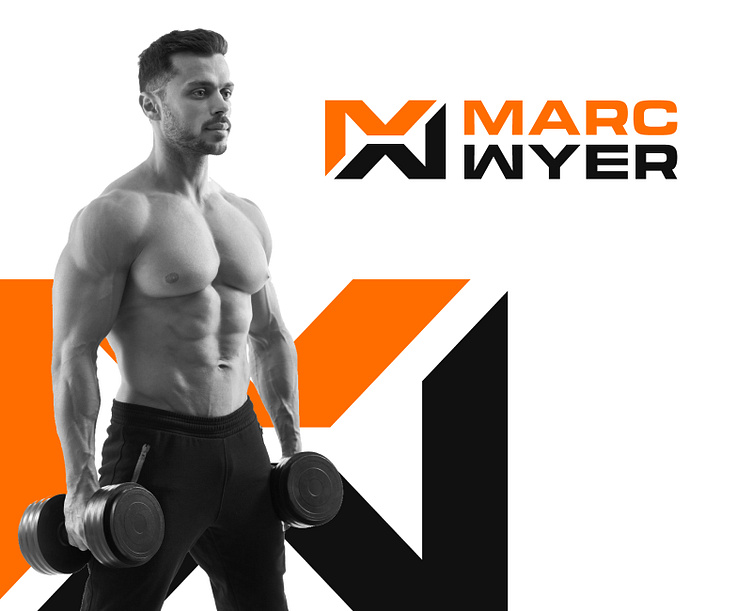
The logo is for a fitness and performance coach based in Melbourne, Australia. The concept of the logo is a combination of the initials M and W from his name Marc Wyer which also creatively forms into a dumbbell-like icon.
The use of orange and black colors is very good combination and very relevant to the industry. They represent energy, strength, and sophistication, and create a high contrast that makes the logo more memorable.
Let me know your thoughts on this.
In need for a distinctive and enduring visual identity? One that brings you closer to your business goals by attracting your ideal customers? Send me message here or shoot me an email at vigodesigns2019@gmail.com
