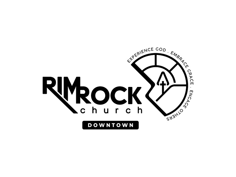
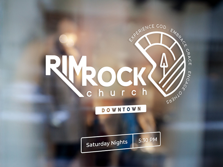
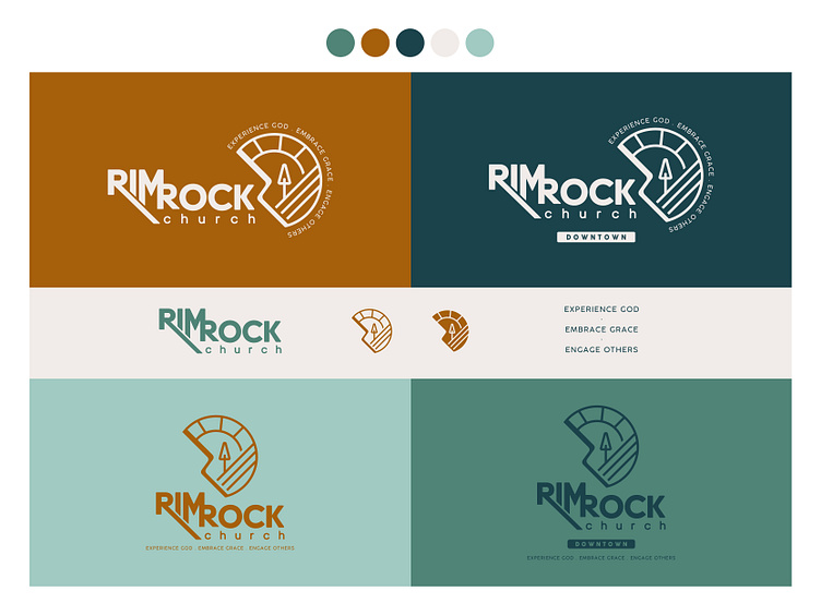
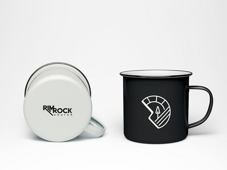
Rimrock Church - Brand Identity Design - Concept 1
Concept for my local church to rebrand and tie the main campus to downtown campus.
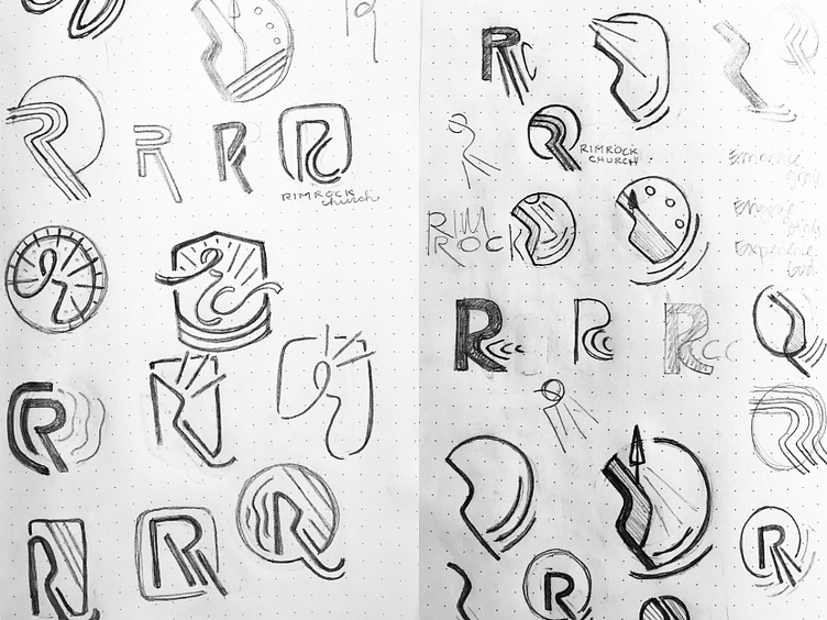
This icon is not a perfect circle, but implies that it is connecting to a circle full of trust and security. The "Rimrock" shape is where God meets you. We are rough and not perfect, but God interjects us at where we are, and brings us to the steadiness, the light, the life (tree/cross) and connects us in that circle. We get to experience God when we allow that space for Him. We embrace the grace given to make the rough smooth. We engage others by welcoming them into community full of light and truth.