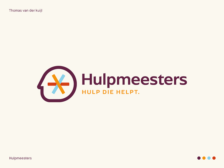
Unraveling Chaos: Hulpmeesters Logo - helping, care, caring
About the Hulpmeesters Logo Design Project
Dear friends. As a seasoned graphic designer, I've had the privilege of working with various clients and industries. But the Hulpmeesters logo design project stands out as one of the most inspiring and impactful projects I've worked on.
Hulpmeesters is a company that provides help when things aren't going well. Their tagline "hulp die helpt" (help that helps) perfectly captures their mission. As a graphic designer, my task was to create a logo that represents the essence of their brand, their values, and their services.
After conducting in-depth research on the company and its target audience, I designed a logo that speaks to their core message. The logo features a head with a "kluwen" (tangle) that represents the chaotic thoughts and situations that people may experience. The modern and colorful design, in orange, blue, red, and purple, conveys the company's energy and forward-thinking approach.
The Hulpmeesters logo is versatile and can be used across various media channels, including print, web, and social media. It's simple, yet effective, with a design that is both memorable and easily recognizable.
As a graphic designer, I believe that a logo should not only look great but also communicate the essence of a brand. The Hulpmeesters logo does just that, it tells the story of a company that offers real help to people in need. It's a testament to my skills as a designer, and I'm excited to see how it helps Hulpmeesters connect with their audience.
Let's team up and take your brand to new heights!
Don't hesitate to get in touch with me via E-mail:
🚀 info@thomasvanderkuijl.com
💼 Let's link up on LinkedIn and take our professional networks to the next level!
📷 Join the Insta-party and catch my latest projects today!
