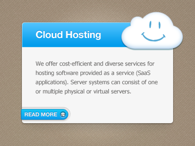
Cloud Hosting/Smaller "Read More" Button
Playing around with the "Read More" CTA button style. I'm thinking this one leaves more room for the text and balanced whitespace while still standing out enough, but I'm still toying with it. Feedback welcome!
More by Lauri Kieksi View profile
Like

