Style Guide UI Kit
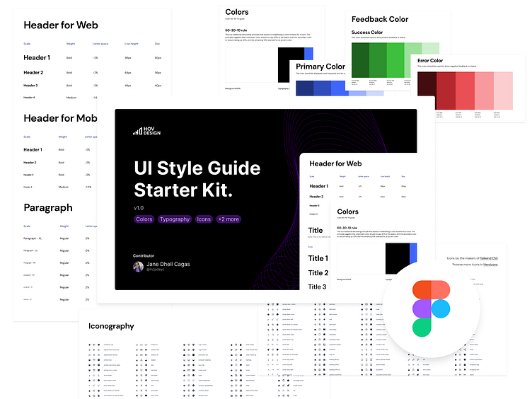
Style Guide UI Kit
Whether you're a designer or a developer, our kit has everything you need to create beautiful and consistent designs.
The Figma Kit includes:
🔤 Typography: a wide range of fonts and styles to help you create text that is both beautiful and legible.
🎨 Color: carefully curated color palettes that will help you create a cohesive and visually appealing look for your product or brand.
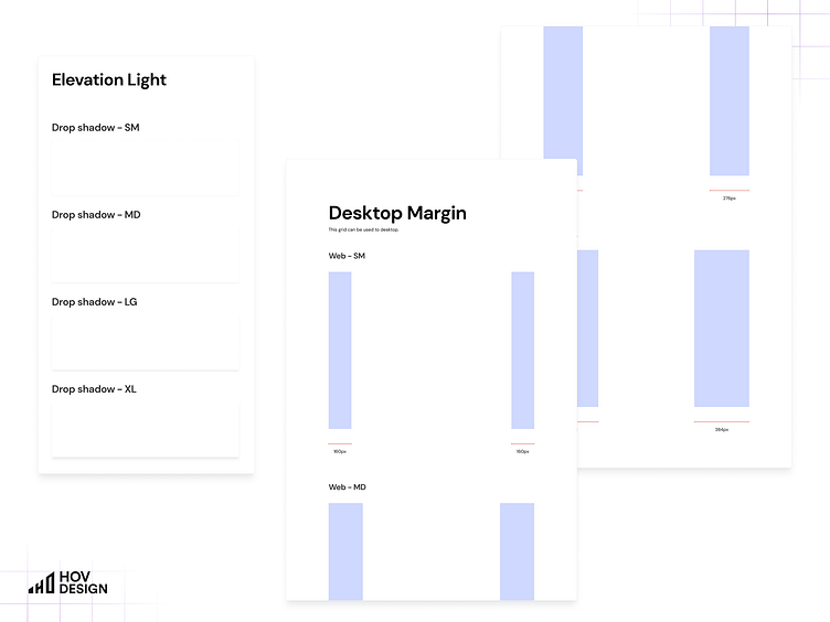
🎆 Effects: a collection of visual effects and design elements that can be used to enhance your designs and make them stand out.
📐 Layout grids: a set of guidelines that will help you create layouts that are balanced and visually pleasing.
🎉 Iconography: a library of icons that are both stylish and functional, and will enhance your designs.
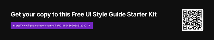
Get your own copy for FREE of the Figma Kit at https://www.figma.com/community/file/1219594362058612280

Follow us at
LinkedIn, Twitter, and YouTube
Join and be a member of our Design Hive Discord
where we also send out members-only resources for free!
Reach out to us at design@hov.co