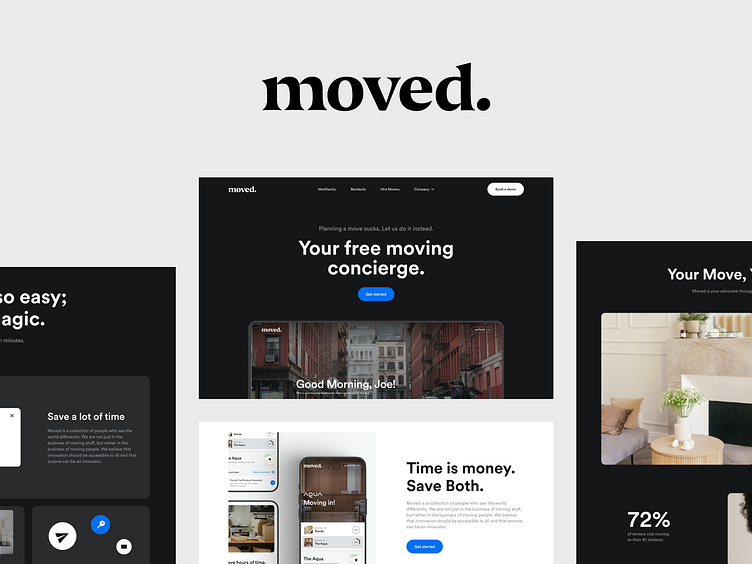
Moved Case Study 3: Service Booking Page Design
Book a Move
We created the Book a Move page, where the user can learn more about moving services, and their benefits, and understand how the platform works.
This informative page should be easy to read and be as clear as possible for the user because they are already halfway through using the product. That's why this page consists of main features elements, atmospheric photos, and smooth motion.
Template Page
We also created a Templated page with various blocks for future pages of the site. This will come in handy if the product gets new features and you need to create a new page on the site. I
It's a smart move!
More by Outcrowd View profile
Services by Outcrowd
Like


