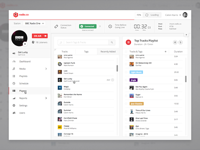
Radio.co App - Playlist Builder
This is a playlist builder that I designed for Radio.co. My aim was to create the most seamless and easy to use experience for the user. Truth to be told, I have seen a lot of ways how people have been trying to deal with building playlists and they all seamed to be too clunky and sometimes even hard to understand. It would be simple if we had to built playlists that consisted only of tracks but to make matters more difficult, Radio.co also uses tags. Tracks can have a variety of different tags to make life easier for the user. So what is the reasoning behind all this? Since people start to browse pages from top left side of the viewport, that's where all the most important and relevant content should live. Once users open up a playlist (no matter from which page), the playlist builder is what they are going to see. For the most part, they will want to make adjustments to it. That's why I placed the search functionality on the left side of the screen and the overview on the right. See how the search results can be filtered by only tracks, only tags or by recently added. Say you uploaded a bunch of new tracks, the first thing you will do is add them to a playlist. You don't want to be hunting around the whole app to see where your tracks are. Well, we'll put them in front of you - just where you'll need them the most. Tracks, as well as tags, can be added to a playlist by dragging and dropping them or simply by clicking on them. Once you hover over a section that contains a track (with album art, album title and the author) or a tag, you'll see an "Add +" label appear. It's there to inform you and gets out of the way when you don't need it. When an item is added to a playlist, the summary section (on the right side) automatically scrolls down to the bottom and your item appears with a flash. I thought that it's important to have that visual indication so that you are 100% sure that the track or the tag has been added. Lesser duplicates and happier users. Renaming or changing the colour of a playlist is simple too. By clicking on the playlist's name, it becomes editable and the same goes for the colour.

