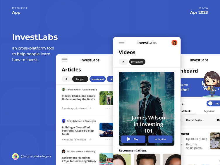
InvestLabs
Design a cross-platform tool to help people learn how to invest
Empowering individuals to navigate the world of investments through a user-centered app, making financial education accessible and engaging.
This was my second project carried out during my journey in Google’s Professional UX Design Certificate (if you want to know more about the course click here).
Let´s Connect
Hey, I’m Patrick Moraes, Brazilian data analyst, MicroStrategy expert, UX/UI designer, nerd and also crypto and NFT enthusiast.
Main Challenges:
Identifying and understanding user pain points and needs.
Balancing functionality with simplicity in the app’s design.
Ensuring a seamless and intuitive user journey throughout the app.
Effectively communicating complex financial concepts in an accessible manner.
Continuously iterating and refining the design based on user feedback and research findings.
Final Considerations
This marks my second end-to-end project in the realm of UX Design. Despite its imperfections, this endeavor has provided me with invaluable experience in navigating each stage of development.
There is undoubtedly room for improvement in both this write-up and the project itself, but I am extremely pleased with the outcome thus far.
This project was carried out during my journey in the Google UX Design course (if you want to know more about the course click here).
Acknowledgements
First I want to thank Google for putting together an amazing UX design course, after all this project is part of one of the training stages from Google UX Design Professional Certificate.
In addition, I also want to thank the other professors who relate to my UI/UX life, they are Felipe “FEUX” from cursodefigma and Gilberto Prado from uiboost.
Many insights that I had and used in this project I also learned from them.
Thanks!


