Project Sparrow UIs - Game Redesign

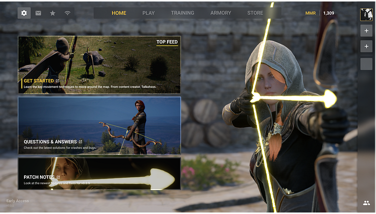
Home Screen ⬆️
Redesigned the interface using the same sort of boxy style while also adding a title and secondary text as well as a sleek border.
What's on the Screen?
Settings, Invites, Leaderboard, Region
Home, Play, Training, Armory, Store
Lastly, we have the MMR which is the games ELO system, and the friends list on the right side which I tried to keep modern and up to date.
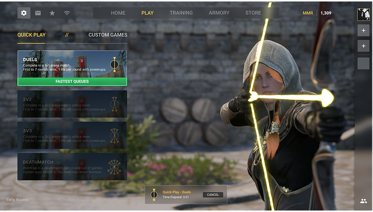
Play Screen ⬆️
I tried to make this interface sleeker and more modern by allowing the developers to work with a little room on right side, regarding animations and other character interactive elements.
I also included a Matchmaking Notification in the bottom middle that is really out of the way and easy to navigate.
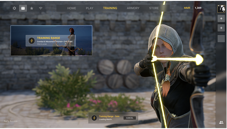
Training Screen ⬆️
There wasn't much to do here as there is just one option and I wanted to leave room for character interactions and maybe some future choices as well for the Developers.
I created the icon elements for the Training Range to compliment the sort of electric arrow that the character is holding, as well as modernized the surrounding box.
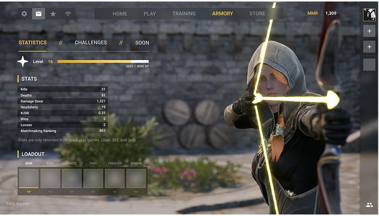
Armory Screen ⬆️
I tried to keep it a simple minimalistic and competitive feel, while also allowing easy navigation between options.
I wasn't able to get any images for the power-ups and items and such for the loadouts as the Developer wasn't online at the time.
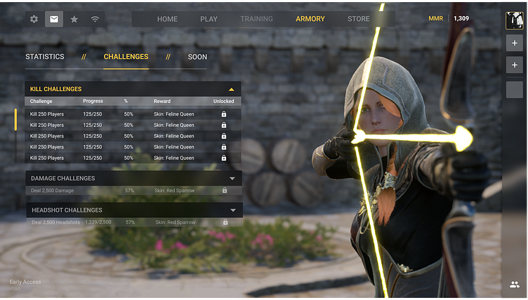
Challenges Screen ⬆️
Keeping that same sort of style from the statistics page I was able to create a very user-friendly challenges system that I feel allows for the developers to add and have freedom around the challenges.
If you're interested in checking out the game for yourself, it's called Project Sparrow and it's available now on steam!