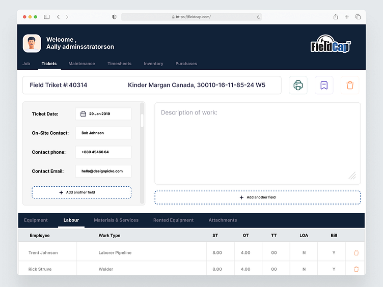
FieldCap Tickets Screen UI Redesign
FieldCap is a software platform that provides field service management solutions for industrial and energy companies. Their platform allows field workers to manage field tickets, timesheets, and invoices in real-time.
The Problem: Current FieldCap Tickets Screen UI (User Interface) is outdated and doesn't provide an optimal user experience. Users find it difficult to navigate, understand and perform tasks, which results in frustration and errors. This leads to a decrease in productivity and efficiency in managing field tickets.
The Solution: To improve the FieldCap Tickets Screen UI, I recommend a redesign that focuses on simplifying the interface, improving visibility, and enhancing usability. The new UI will provide a better user experience, leading to increased productivity, accuracy, and user satisfaction.
Benefits will be:
Improved accuracy
Reduced training time
Enhanced user satisfaction
Increased productivity as well.
Are you looking for Cost-Effective Unlimited Design Collaborator?
No matter short or long term projects!
Website: www.designpicko.com
Work Inquiries 👉 ashikxql@gmail.com
Check My UX UI Case study: Medium
UI/UX Design Tips - Instagram
UI Design Kit - Gumroad
Check My Linkedin | Twitter | Instagram | Facebook | Behance


