Potross Financial | Website | UI/UX
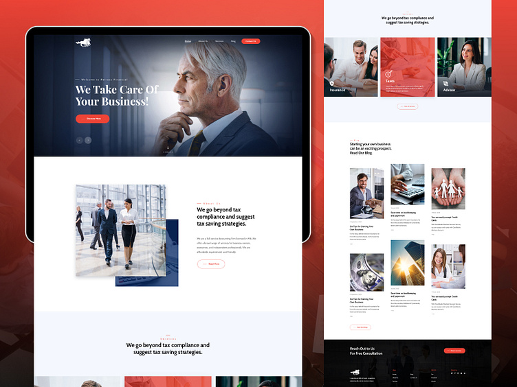
To educate and inform their site visitors about their offerings, we structured the content across the site in a way that would be engaging for visitors, leading them on a journey as they explored all of the helpful resources available on the site and encouraging them to get in touch for more personalized guidance. The chosen color palette was full of vibrant reds and energetic blues that spoke to the innovative, growth-focused mindset of the brand. The use of gradients across the site paired with people-focused imagery, and a clear information hierarchy helps the eye to focus on what is most important.
