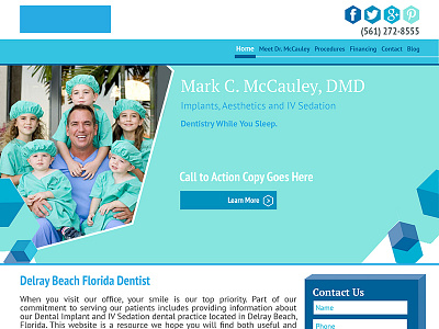
Mccauley Dental
The Problem:
McCauley Dental was in need of a redesign. The previous website was hosted on something archaic that made it impossible for them to rank. Content had been added over the years and lacked the necessary IA to give users the experience they were looking for.
The Goal:
My goal was to reorganize all content into an infrastructure that would rank. I updated the look of their website, applied SEO and simplified the user experience.
The Design:
Color Scheme - I chose a color scheme based on 3 shades of blues and one green inspired by the scrubs Dr. McCauley and his practitioners wear every day. Additionally, blue is a calming color – soothing for anyone nervous about going to see the dentist. I kept everything else clean and white to emulate a sparkling white smile.
Hexagons & Cubes - Dr. McCauley values his family and children above all else. From researching their past website, it's clear to seethey're just as much of a part of McCauley Dental as its employees. I think this is a beautiful charm for McCauley and I wanted to keep that going throughout the site, which is why I used geometric blocks and hexagons. Figuratively, the blocks remind me of children's building blocks and are scattered throughout the webpages. They bring a playful touch to the website yet still remain professional in design to appeal to adults. Hexagons are used throughout the site as well to promote action, evident in its calls to action.
Header - The top header links to McCauley's social media and has his phone number which will be clickable on mobile. The blue box in the lefthand corner will be replaced by a logo (coming soon!)
Menu - The menu is more compact and will be organized through three tiers. White text and a blue rectangle indicate what page the viewer is currently on. When the mouse hovers over a menu selection, any subsections will pop down below. For example, when hovering over 'Procedures' options for 'IV Sedation,' 'Dental Implants,' etc will pop down.
Slider - The head image will not be stationary. It will be a slider rotating every couple of seconds to display services, specials and other important information. Each sliding image will have a strong call to action.
Contact Box - The contact box is important and will appear on just about every page. This gives viewers easy access to engagement.
Image Sections - These eye-catching image sections with large, brief copy are attractive for viewers and gives them a quick taste of information so they don't become overwhelmed by text while scrolling through the homepage.
Services - Service squares are good for SEO to get keywords on the home page and also good for people by giving them needed information. There is a blue hue over all images but when scrolled over will lose the blue hue. This reinforces active behavior and used as a "reward" of sorts for the viewer to know action is taking place (sort of like when you push a door, it opens to reinforce behavior)


