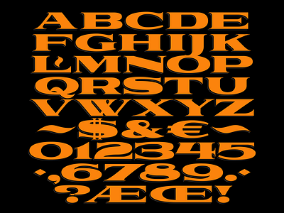
Heavyweight Typeface - Platform (WIP)
Hey Dribbble, it's been a while, but I've been working on a lot of hush-hush stuff for the past few months - but I can show you something that I've been toiling over in my spare time.
Here's a type style I've been developing now for the better part of a month now in-between client work and commissioned projects. The working title for this one is "Platform" as it's inspired by early 20th century train car and station lettering. The letters needed to be particularly wide to adequately stretch the length of a passenger train's car either above or below the windows. I'd imagine that this style could also be adapted for use within the sign-painting community for transom windows and long horizontal fascia work.
I plan on developing a more full character set over time including additional punctuation marks, diacritics, and a handful of special characters. No lowercase is planned for the time being due to the the x-height being so low that this style favors a cap's only approach. Small caps is a possibility though, as well as angled serifs for alternates. Stay tuned!

