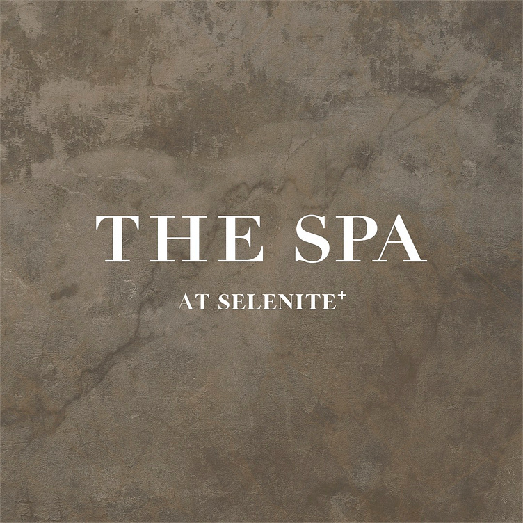
The Spa at Selenite - Logo
Our teams goal when designing a logo for The Spa at Selenite, was to utilize the company's brand fonts and design principles like spacing and unity to create a harmonious relationship with its parent company, Selenite Beauty.
To emphasize "The Spa," the hierarchy and scale of the logo was adjusted to draw the viewer's attention to that specific word. By doing so, "The Spa" can become the focal point of the logo, and the overall design can successfully communicate the essence of the new brand. Consumers familiarity and current relationship with Selenite allowed us to minimize the brand name while highlighting the new branch of the business.
The use of textured limestone wall creates a modern yet old world feel that reflects the interior design of the space. My use of merging our teams logo design with this textural element created a sense of depth and a want to escape to this tranquil oasis. This introductory post was used to announce the sister company to their existing clientele across social media platforms.
