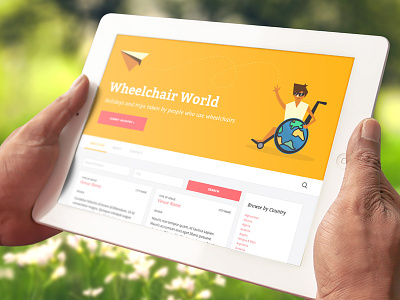
Wheelchair World Illustration
Is it a good way to get rid of skin colour reference? What would be other options?
A little illustration and a site design for wheelchair users to submit reviews about places they've been.
Press L to show some love.
By Blue & Yellow Design »
Follow: @Sanik
More by Sasha Lantukh View profile
Like


